fonts
Free
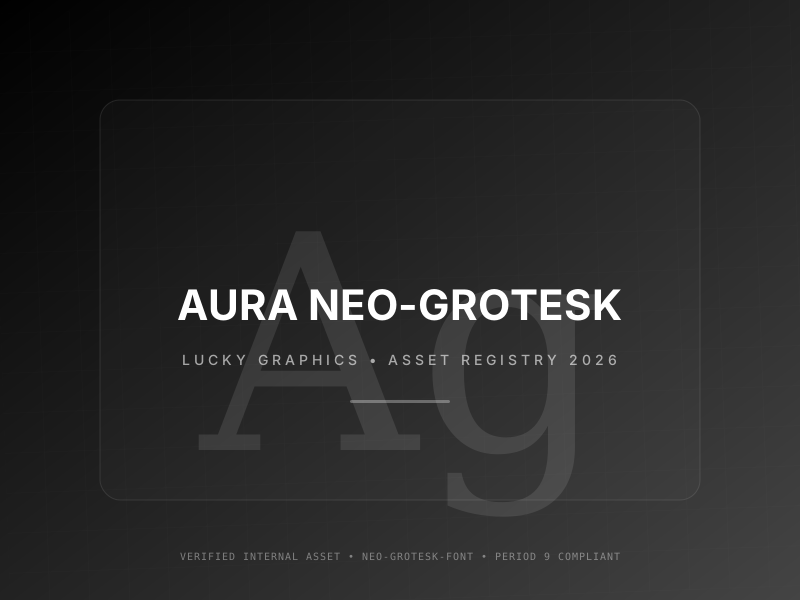
Aura Neo-Grotesk
🍀 Directory Note
"The 'Invisible' font. Perfect for when the content must be king."
Primary Use Cases
- 1Medical / Healthcare Apps
- 2Government & Public Sector Sites
- 3Complex Data Dashboards
- 4Banking Interfaces
- 5Educational Platforms
Technical Data
Weights
Variable
Format
WOFF2
Style
Neo-Grotesque
Legibility
High
Directory Analysis & Suitability
Key Advantages
- Zero-pretension neutrality focuses 100% on information density
- Mathematical precision in vertical stroke balance prevents visual fatigue
- Highly optimized for accessibility-critical medical or banking UI
Considerations
- Lacks a distinct 'Brand Voice' for creative or artistic projects
- Can feel 'Cold' or 'Sterile' in more human-centric layouts
Platform Compatibility
Web Environment
Exceptional. The safe choice for enterprise dashboards.
Mobile & Touch
Optimized. Cleanest rendering on high-DPI panels.
Desktop Software
Exceptional. Professional standard for documentation.
Publisher-Listed Usage
Not independently verified
Developed By
Indian Type Foundry
License Type
ITF Free License
Access Model
Open Source