Playfair Display
🍀 Directory Note
"The default free display serif for editorial headlines, with an open license and real variable range."
About Playfair Display
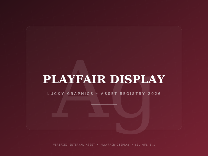
Playfair Display is a high-contrast serif drawn for headlines, designed by Claus Eggers Sorensen and listed on Google Fonts since 2011. The current release is a variable font with a weight axis from 400 to 900, in upright and italic, and subset coverage that includes Latin, Latin Extended, Cyrillic, and Vietnamese, per the family metadata in the Google Fonts repository. Thick strokes, hairline joins, and a poised italic make it the standard free choice for fashion, culture, and editorial cover lines set at large sizes.
The license is the SIL Open Font License 1.1: the OFL.txt in the Google Fonts repository carries the Playfair Display Project Authors copyright (2017) and keeps Playfair Display as a reserved font name. The OFL allows use, embedding, modification, and redistribution of the font files, including inside commercial products and client work, as long as the copyright notice and license stay with the files and the font is not sold on its own. No fee, no per-project tier, and no attribution required in the visible design.
Primary Use Cases
- 1Magazine and editorial cover lines
- 2Fashion and beauty brand headlines
- 3Culture, opinion, and journal hero type
- 4Book covers and event posters
- 5Elegant landing page display type
Technical Data
Format
Variable font (TTF in the source repository; WOFF2 via Google Fonts)
Axes
wght 400 to 900, upright and italic
Style
High-contrast transitional display serif
Designer
Claus Eggers Sorensen
Language support
Latin, Latin Extended, Cyrillic, Vietnamese
License
SIL Open Font License 1.1 (OFL.txt in the Google Fonts repository; reserved font name: Playfair Display)
Source
github.com/clauseggers/Playfair (distributed via Google Fonts)
Expert Audit & Verdict
Playfair Display has been the free headline serif for so long that its strengths are easy to understate. The design pairs heavy vertical strokes with hairline horizontals and serifs, and that contrast is what reads as editorial on a page: a Playfair headline at 72 pixels needs no other styling to signal fashion, culture, or opinion. The italic is a real drawing, not a sloped roman, with the calligraphic lean that pull quotes and standfirsts want.
The variable release tidied the family's production story. One file spans weight 400 to 900, which lets a headline system tune weight to size instead of jumping between named cuts: 500 for section heads, 700 to 800 for cover lines, 900 used sparingly where the layout is mostly air. In CSS, a single @font-face with a weight range replaces the row of static files older projects still carry, and the file subsets cleanly, since the repository metadata lists Latin, Latin Extended, Cyrillic, and Vietnamese coverage that most projects only partly need.
Its limits are the limits of its class. There is no optical size axis, so nothing redraws the hairlines as type gets small; below roughly 20 pixels the thin strokes start to disappear on ordinary screens, and in body text the contrast turns tiring within a paragraph. Teams reach for Playfair as a full editorial family and then set captions in it, which is the one job it was not drawn for. The standard fix is a pairing: Playfair for display, a text serif such as Newsreader or Source Serif 4 for reading, and the two together reproduce the structure of a commercial editorial family at no license cost.
Ubiquity is the other honest cost. Playfair headlines appear in thousands of templates, so the family alone will not make a brand distinctive. Weight discipline, letterspacing, and a strong text pairing do more for identity than swapping to an obscure display face with weaker drawing.
The license is the SIL Open Font License 1.1, recorded in the OFL.txt shipped with the family: commercial use, embedding, and redistribution with the notice attached are all allowed, modified versions must stay under the OFL, and the reserved name Playfair Display cannot title a modified version. For client work that means the files can be handed over, archived with the project, and reused on the next job without a new purchase. Keep the OFL.txt in the project folder beside the brand files, and the question of font rights never has to be reopened halfway through a job, which is exactly where trial-font substitutions usually go wrong.
Directory Analysis & Suitability
Key Advantages
- High stroke contrast gives headlines a fashion and editorial register few free serifs reach
- Variable weight 400 to 900 with true italics covers a full headline hierarchy in one file
- Cyrillic and Vietnamese subsets alongside Latin make it usable for multilingual editorial brands
Considerations
- No optical size axis: the hairline strokes are drawn for display and thin out at text sizes
- Standard width only, so tight one-line headlines designed around a narrow serif need rework
- Very widely used in templates, so an unmodified default setting can read as a stock look
Platform Compatibility
Web Environment
Excellent for headlines and hero type; pair with a text serif or a neutral sans for body copy.
Mobile & Touch
Very good at display sizes; keep it out of captions and dense paragraphs.
Desktop Software
Excellent in layout tools for covers, posters, and brand decks.