fonts
Free
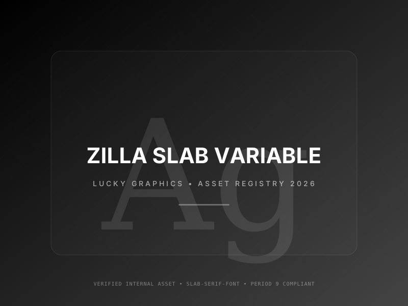
Zilla Slab Variable
🍀 Directory Note
"The slab serif that doesn't feel like a typewriter."
Primary Use Cases
- 1Editorial Blog Headers
- 2Developer Documentation Highlights
- 3Industrial Brand Identities
- 4Code Block Comments
- 5Educational Course Titles
Technical Data
Weights
Variable
Classification
Slab Serif
Origin
Mozilla Foundation
Format
WOFF2
Directory Analysis & Suitability
Key Advantages
- Industrial-strength industrial curves that feel modern, not academic
- Variable weight axis provides fine-tuned control for editorial hierarchies
- High-impact slab stems maintain presence even as background accents
Considerations
- Strong industrial vibe can clash with soft, organic brand styles
- Requires careful spacing (tracking) in bold variable ranges
Platform Compatibility
Web Environment
Exceptional. Perfect for editorial sidebars and pull-quotes.
Mobile & Touch
Excellent. High-impact visibility on social cards.
Desktop Software
Stunning. Powerful for high-impact hero headers.
Publisher-Listed Usage
Not independently verified
Developed By
Google Fonts
License Type
SIL OFL 1.1
Access Model
Open Source