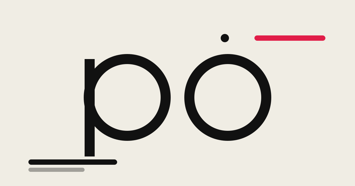
Poppins
🍀 Directory Note
"The friendly geometric default: a two-script family with a full weight range that made rounded, monolinear type the safe startup choice, priced in distinctiveness rather than money."
About Poppins
Poppins is a geometric sans-serif developed at Indian Type Foundry between 2013 and 2016 and added to Google Fonts in 2015. The Latin was initially designed by Jonny Pinhorn and the Devanagari by Ninad Kale, and the ITF studio team later refined the family and expanded it to more weights and italics. It is a two-script family: Google Fonts describes the Devanagari as the first Devanagari typeface with a range of weights in this geometric genre, and its base character height matches the Latin ascenders, so Hindi and English set side by side share the same visual lines instead of one script sitting smaller than the other. The Latin follows the classic geometric recipe, near-perfect circles for the round letters, monolinear strokes with optical corrections where a strict construction would look dark or light, and a large x-height that keeps text open at small sizes.The family covers nine weights from Thin (100) to Black (900), each with a matching italic, and stylistic alternates that include a single-story a for a softer, more informal setting. Distribution is through Google Fonts and the source repository at github.com/itfoundry/poppins, and the license is the SIL Open Font License 1.1: use, embedding, modification, and redistribution are allowed, including in commercial products and client work, as long as the copyright notice and license travel with the files and the font itself is not sold on its own. No attribution is required in the visible design.
Primary Use Cases
- 1Startup and SaaS marketing sites and landing pages
- 2Multilingual product UI shipping Latin and Devanagari together
- 3Headline systems that run on SemiBold and Bold
- 4Posters, menus, and wayfinding with friendly geometric type
- 5Brand identities on a zero type budget
Technical Data
Format
Static TTF/OTF styles (WOFF2 served via Google Fonts)
Weights
100 to 900 in nine steps (Thin to Black), each with a matching italic; 18 styles
Scripts
Latin, Devanagari
Designers
Jonny Pinhorn (Latin), Ninad Kale (Devanagari)
Foundry
Indian Type Foundry (developed 2013 to 2016; added to Google Fonts June 2015)
License
SIL Open Font License 1.1 (OFL.txt in github.com/itfoundry/Poppins and google/fonts ofl/poppins, checked October 2026)
Source
github.com/itfoundry/poppins; also distributed via Google Fonts
Editorial review
Poppins is the rare free font with a real design argument behind it. Geometric sans-serifs were a European idea, drawn for Latin letterforms. Kale's Devanagari applies the same circle-based construction to Devanagari, which Google Fonts describes as the first Devanagari typeface with a range of weights in this genre, and Pinhorn's Latin is drawn to sit with it: the two scripts share stroke weight, texture, and vertical measure, which is why Poppins holds together in the bilingual interfaces and packaging that much of its home market produces daily.The drawing itself is disciplined. Round letters are honestly circular, strokes are monolinear, and the corrections are optical rather than decorative: where a mechanically perfect junction would print dark, the file quietly cheats. The large x-height does the practical work, keeping counters open at caption sizes and on cheap Android screens, which is the environment a large share of its audience actually uses. Switch on the single-story a alternate and the voice drops half a register, from corporate-geometric to something nearer a schoolbook hand.The weight range is the production story. Nine weights with true italics is a complete system: Thin and ExtraLight for oversized display, the middle weights for interface text, SemiBold and Bold for the headline hierarchy most marketing sites run on. The catch is delivery. Poppins ships as static styles, so a self-hosted site using five weights carries five files per script before italics, and the discipline the Google Fonts self-hosting guide teaches, subsetting and preloading only what the page uses, is not optional decoration.The license is the SIL Open Font License 1.1, the standard Google Fonts grant: commercial use, embedding, modification, and redistribution with the license attached are all allowed, and selling the font files on their own is the standing prohibition. A team can build a brand, an app, and a client handoff on Poppins with one license file as the entire paperwork burden.The honest cost is sameness. Poppins became the default startup sans, and a brand set entirely in it will resemble several thousand others. Distinctiveness has to come from colour, imagery, layout, or a contrasting partner face. Long-form reading is the other limit: at book sizes the geometric construction and closed apertures tire faster than a humanist sans with varied stroke and open joins.Bottom line: choose Poppins when a product needs a warm, complete, zero-cost type system, especially across Latin and Devanagari, and bring the personality from somewhere else in the design.
Directory Analysis & Suitability
Key Advantages
- Nine weights from Thin to Black, each with a matching italic, cover display and text roles inside one family
- Latin and Devanagari drawn as one design, with the Devanagari matched to the Latin ascender height for mixed-script settings
- Large x-height and monolinear strokes keep interface text and captions open and even at small sizes
Considerations
- Ubiquity is the tax: Poppins is very widely used on the web, so it lends a brand little distinctiveness on its own
- Pure geometric construction and fairly closed apertures are less forgiving in long body text than a humanist sans
- Distributed as static styles, so self-hosting several weights means several files to subset, preload, and manage
Platform Compatibility
Web Environment
Excellent. Take the WOFF2 files from Google Fonts or self-host subsets; tighten display tracking slightly at headline sizes.
Mobile & Touch
Excellent for product UI and captions; the large x-height survives small sizes and low-density screens.
Desktop Software
Very good in decks, posters, and brand documents that want a friendly geometric voice without a license fee.