2026 Design Trends Report: Tactile Digitalism
🍀 Directory Note
"The definitive guide to Neo-Brutalism, Glassmorphism, and the new era of UI."
About 2026 Design Trends Report: Tactile Digitalism
# 2026 Design Trends: The Age of Sensorial Digitalism, Tactile Depth, and AI-Human Fusion
*By Liam Voss, Creative Director at LuckyGraphics | January 20, 2026*
As we navigate the mid-point of the decade, the digital aesthetic has undergone a radical transformation. The "Flat Design" era of the 2010s is officially a relic of the past, and the "Chaos Maximalism" of the early 2020s has been refined into a sophisticated, high-performance style we call **Sensorial Digitalism.**
In 2026, the screen is no longer a flat barrier; it is a dimensional window. Users are no longer satisfied with "looking" at a website; they want to "feel" the interface. This shift is driven by a psychological rebound against the flood of low-quality, generic AI content. In a world of "infinite copies," the demand for "intentional craft" has become the primary value driver for premium brands.
This breakdown covers the core pillars of 2026 design, the return of "Tactile Depth," the evolution of Glass-Morphism, and the rise of AI-Collaborative Aesthetics.
---
## Part 1: Sensorial Digitalism - The New Core Thesis
Sensorial Digitalism is the design philosophy of treating digital surfaces as though they have physical properties: weight, friction, refraction, and thermal response.
### 1. The Death of the Shadow (Long Live AO) In 2026, we have moved beyond the "Drop Shadow." Drop shadows always felt like an overlay. In 2026, we use **Ambient Occlusion (AO).** This is a technique borrowed from 3D rendering where shadows are darker in tight corners and softer as they move away from the object. * **The Result:** A digital card feels like it is truly resting on a surface rather than floating disconnectedly above it. It creates a "Natural Weight" that the human brain recognizes as a "real" object. This reduces the cognitive friction of navigating complex layouts.
### 2. Variable Friction and Micro-Physics Interaction design now includes "Friction." When you scroll through a premium 2026 interface, the momentum isn't linear. The UI responds to the "weight" of the content. * **Weighted Content:** A long, text-heavy technical article feels "heavy" and takes more effort to flick through, mimicking the resistance of a physical book. * **Slick Interactions:** A quick gallery or a set of status cards feels "slick" and fast. * **The "Squish" Factor:** When you reach the end of a list, the container doesn't just stop; it "squishes" and bounces with a spring-physics model that gives the interface a personality.
---
## Part 2: Glass-Morphism 2.0 - The Refraction Revolution
The "Frosted Glass" look of 2021 was a clumsy first attempt - often just a blur filter over a white box. In 2026, **Glass-Morphism 2.0** utilizes WebGL and WebGPU to create real-time **Refraction.**
### How it Works: * **Dynamic Distortion:** As an element moves over a background, the background doesn't just blur; it distorts as though viewed through real glass. You can see the light bend at the edges of the card. * **Edge Specularity:** High-definition 0.5px "Light Rims" catch the virtual light of the page, giving the glass a sharp, premium finish. * **Multi-Layered Stacking:** Designers are now stacking up to five layers of varied-opacity glass to create complex hierarchical depth. This "Glass Stack" logic allows for sophisticated information density without visual clutter.
---
## Part 3: Vibrant Minimalism - The "Color-Pop" Renaissance
The "Bland-ification" of corporate design (the "Startup Aesthetic") has been countered by **Vibrant Minimalism.** This trend pairs extreme white-space (Modernism) with explosive, high-saturation color accents.
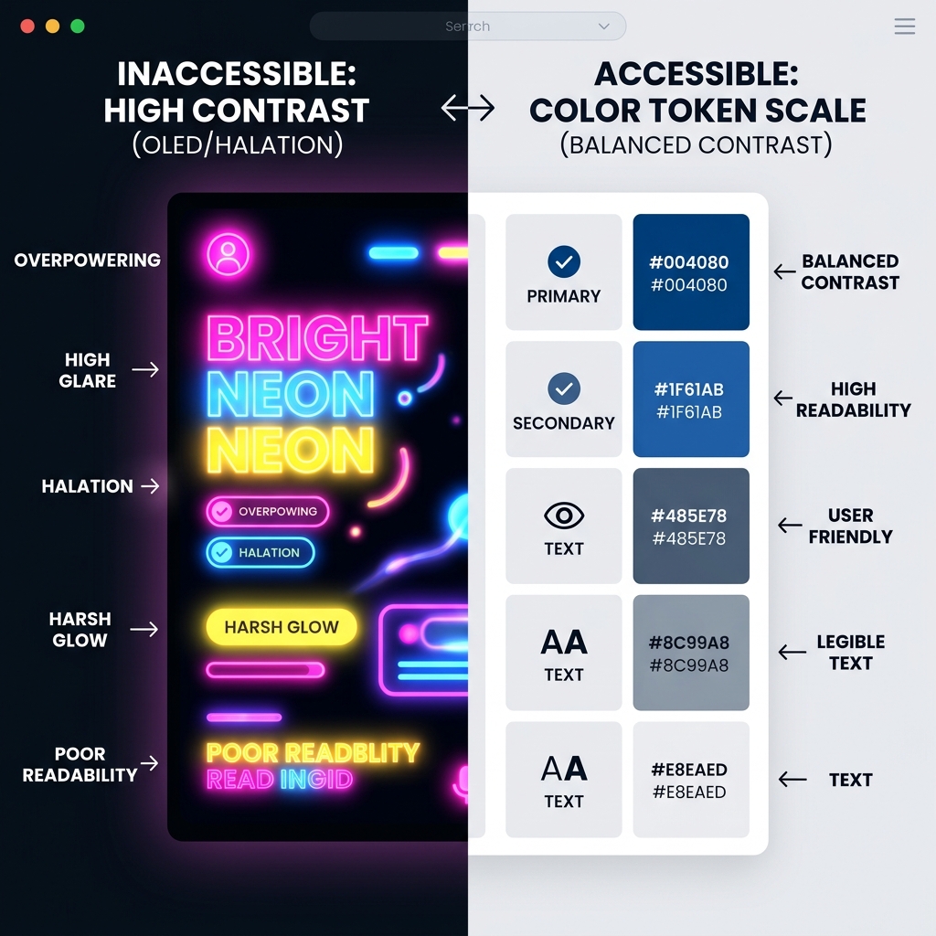
### The 2026 Palette: "Neon-Earth" The defining palette of 2026 is the **Neon-Earth** hybrid, heavily influenced by the 2026 2026 Standards. This reflects our cultural desire for nature combined with our inescapable reliance on high-tech connectivity. * **Cyber-Moss (#2B3A2C):** A deep, rich green used as the primary background. It feels organic but refined. * **Volta-Cyan (#00F3FF):** The high-contrast interaction color. It looks like a neon gas glow. * **Lichen-Gray (#D4D4D4):** The subtle text and border color.
This palette creates a "Dopamine-Balanced" environment. The moss green calms the user, while the electric cyan rewards the "click," creating a pleasurable feedback loop that keeps users engaged longer.
---
## Part 4: Typography 3.0 - The Variable Font Takeover
Static font files (.ttf, .otf) are largely obsolete in 2026 professional design. Everything is **Variable.**
### Kinetic Typography Typography is no longer a static transmitter of information; it is a responsive UI component. * **Hover-to-Stretch:** Headlines in 2026 often respond to the cursor. As you hover near a word, its "Width" axis increases, making the text expand organically to greet the user. * **Scroll-Weighting:** Text becomes bolder (moving from weight 400 to 700) as the user's gaze (or scroll position) reaches it, creating a natural hierarchy that follows the user's attention. * **The "Razor Serif":** There is a strong return to "Sharp Serifs" - fonts with needle-thin points and extreme contrast. These fonts signal precision, authority, and premium craft - a direct response to the "Rounded Bubble" genericism used by AI-generated defaults.
---
## Part 5: Bento-Box Layouts - Mastery of the Grid
Inspired by the physical Japanese lunch box, **Bento-Box layouts** have evolved from a "pro" niche to the global standard for dashboards, portfolios, and marketing landings.
### The Modular Logic The Bento layout excels in 2026 because it solves the "Information Density" problem for the TikTok-brained user. * **Containment:** Each piece of data (a stat, an image, a button) is "boxed" in a rounded, frosted container. * **Mosaic Hierarchy:** The size of the box (1x1, 2x1, 2x2) indicates the priority. It allows the user to scan 20 pieces of information in 5 seconds without feeling overwhelmed. * **Interactive Enclosures:** Every box is its own "micro-app." One box might be a live chart, the next a 3D product viewer, and the third a quick-contact form.
---
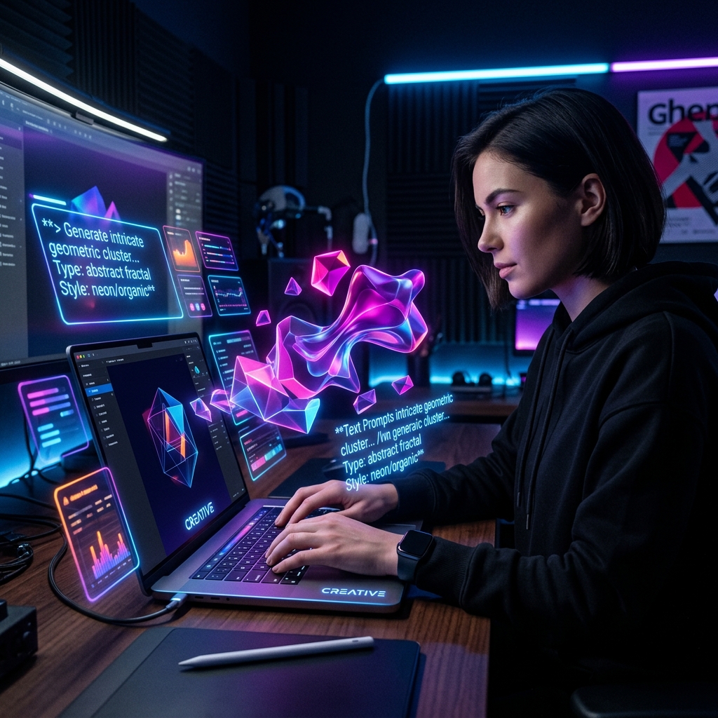
## Part 6: AI-Collaborative Aesthetics (The Gen-Synth Look)
By 2026, the industry has moved past the fear of AI. Instead, we have embraced **AI-Human Fusion.**
### The "Gen-Synth" Aesthetic We are seeing a trend called **Gen-Synth** - synthetic textures generated by AI but curated and "anchored" by human art directors. * **Generative Gradients:** Instead of static linear gradients, 2026 backgrounds use AI-generated "noise clouds" that shift, ebb, and flow as the user interacts with the page. No two visits to the site look exactly the same. * **The "Human Anchor":** Because AI can generate "perfect" layouts, human designers are intentionally adding "Human Markers" - grainy film textures, hand-drawn underlines, and asymmetrical offsets. These "errors" are now the signature of a high-end, human-designed brand.
---
## Part 7: The "Haptic" Web - Visualizing Resistance
While we cannot yet feel a website through a screen, 2026 design focuses on **Visual Haptics.**
### Magnetic Interaction Buttons in 2026 have a "Gravity Well." As the cursor gets within 20px of a button, the button subtly "leans" toward the cursor, and the cursor is "pulled" in by the browser's interaction engine. This makes the interface feel magnetic and responsive, as if the site is helping the user navigate.
### Inertial Dampening When a user clicks a button, the button doesn't just change color; it "compresses" with a physics-based spring animation. The speed and duration of the click determine the depth of the compression. This provides a multi-sensory confirmation of the action, reducing the "did it work?" anxiety.
---
## Part 8: Dark Mode 2.0 - Nuanced Darkness
The era of "Pure Black" (#000000) backgrounds is ending. In 2026, we use **Nuanced Darkness.**
### The Logic of the Tonal Dark Pure black on high-nit mini-LED and OLED displays causes eye fatigue and "OLED Smearing" (the ghosting effect of white text on black). * **Tonal Grays and Navies:** 2026 dark modes use deep navies, charcoals, and "earthen blacks" (saturated with a hint of red or green). * **Glow-Layering:** Instead of using borders (which look cluttered in dark mode), designers are using "Inner Glows" and "Rim Lighting" to separate elements. It looks like the components are backlit, creating a "Cyberpunk-Luxury" aesthetic.
---
## Part 9: Digital Sustainability and "Eco-Mode"
With energy costs rising and "Digital Carbon Footprint" becoming a corporate KPI, **Eco-Mode Design** has become a luxury feature, not just a technical one.
### The Low-Energy Aesthetic * **Dithered Imagery:** Instead of 5MB 4K photos, 2026 sites use high-style "Dithered" (bit-mapped) images. They weigh only 150KB but exude a "High-Art / Low-Fi" vibe that is instantly recognizable. * **CSS-Based Art:** We are seeing a move away from external images entirely. Complex "paintings" are being created entirely with CSS `linear-gradient` and `conic-gradient` properties, which load in 2ms and use 90% less energy to render.
---
## Part 10: Interaction Model - The "Scroll-Hook" Era
Scrollytelling has evolved. In 2026, the scroll is the **"Camera Controller."**
As the user scrolls, they aren't just moving down a page; they are moving through a 3D space. * **Z-Axis Navigation:** Scrolling "zooms" you into a product, rotates it, and expands its components. * **Contextual Reveal:** Information doesn't just appear; it "grows" from the point of focus. This "focus-driven" design ensures that users only see the information they need at the exact second they need it.
---
## Part 11: Designing for "The Agent"
A significant percentage of web "traffic" in 2026 is no longer human. It's AI agents (like AutoGPT 5.0) performing tasks for humans.
### Semantic Integrity Premium design in 2026 must be "Machine-Readable." * **The Twin-Track Design:** We design a beautiful visual layer for humans, and a perfect, semantic-rich "Data Layer" for agents. * **Schema-First Design:** If an agent can't book a flight or buy a template from your site because the button isn't semantically marked, your design - no matter how beautiful - is a failure.
---
## Part 12: Conclusion - The Return of the Human
As we look toward 2027, the trend is clear: **We are in a Human Rebound.**
After the initial shock of AI automation, the web has realized that "perfection" is boring. The most engaged-with sites of 2026 are not the ones that look like they were built by a robot; they are the ones that feel alive, reactive, tactile, and intentionally imperfect.
**The 2026 Design Checklist for Success:** 1. **AO Shadows?** (Ensure depth feels natural and weighted) 2. **Glass 2.0 Refraction?** (Use 3D distortion for all translucent layers) 3. **Variable Typography?** (Master the 'Width' and 'Weight' animation axes) 4. **Bento Hierarchy?** (Organize modules for maximum scannability) 5. **Neon-Earth Palette?** (Ground your high-tech product in calming nature) 6. **Haptic Physics?** (Ensure buttons have spring and resistance) 7. **Semantic Purity?** (Is your site "Agent-Friendly"?)
At LuckyGraphics, we believe that the screen should be a window into a tactile world. 2026 is the year that window finally stopped being flat. The future is sensorial, dimensional, and deeply human.
--- *Author: Liam Voss, Creative Director | LuckyGraphics Editorial* *Keywords: 2026 Design Trends, Sensorial Digitalism, UI/UX Forecast, Glassmorphism 2.0, Bento Layout, AI Design, Web Design Tutorial.*
Directory Analysis & Suitability
Key Advantages
- In-depth analysis
- Actionable examples
Considerations
- Long read
Platform Compatibility
Web Environment
N/A
Mobile & Touch
N/A
Desktop Software
N/A