Accessible Color Contrast Guide 2026
🍀 Directory Note
"A deep dive into perceptual luminance modeling, APCA, and OLED-safe dark mode tokens."
About Accessible Color Contrast Guide 2026
## The New Science of Accessible Color Contrast in 2026
In 2026, accessible color contrast is no longer just about passing basic WCAG 2.1 AA mathematical tests - it is about **perceptual luminance modeling**, dynamic HDR scaling, and hardware-aware contrast tokens. As more users shift between true-black OLED displays in the dark and high-nit outdoor screens, your color palette must adapt dynamically to remain legible and beautiful.
### Why Standard WCAG Math Fails on Modern Screens
The standard WCAG 2.1 contrast formula ($$(L1 + 0.05) / (L2 + 0.05)$$) was designed for sRGB monitors over a decade ago. It measures mathematical contrast, but it often fails at perceptual contrast.
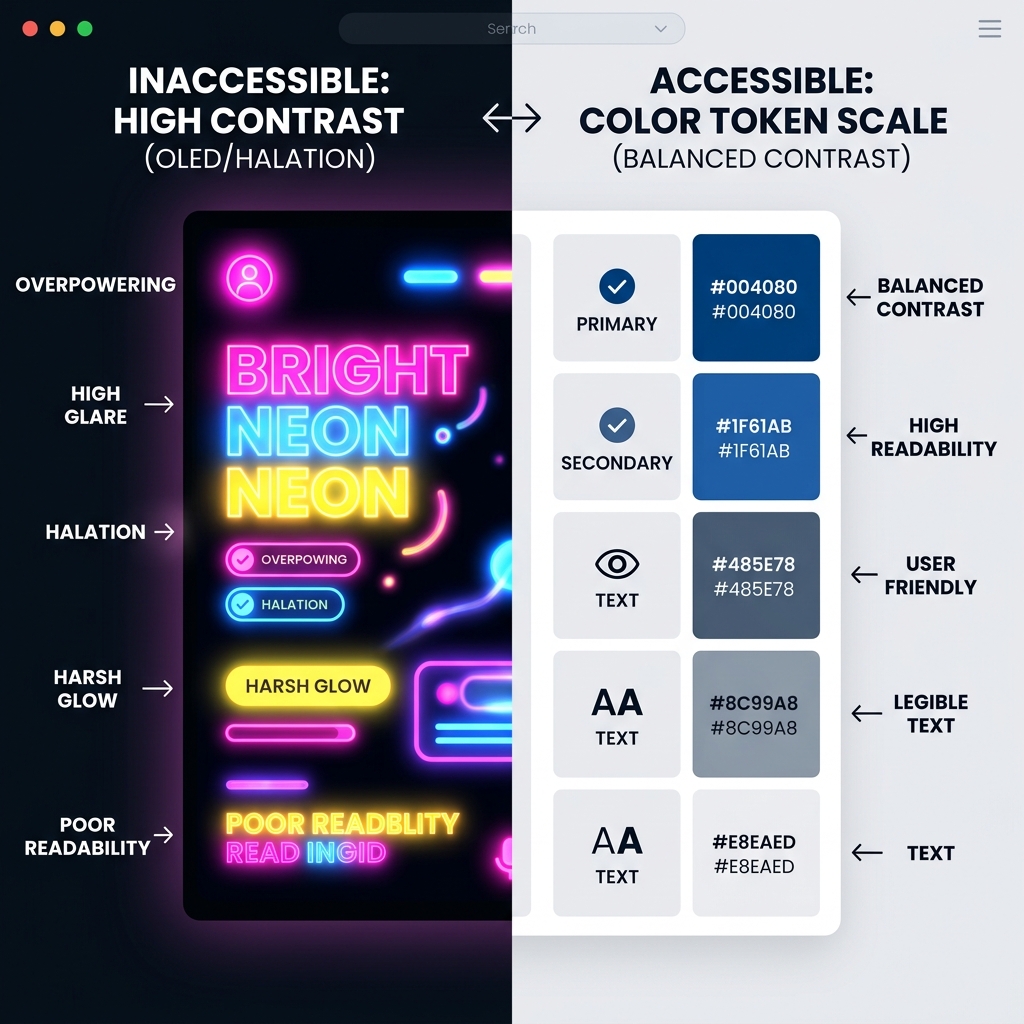
For example, a high-saturation blue background with white text might pass WCAG 2.1 mathematically, but it can cause visual vibration and halation (the "blooming" effect) on a bright OLED screen, rendering it illegible for astigmatic users.
In 2026, professional designers use the **APCA (Accessible Perceptual Contrast Algorithm)** model, which measures contrast based on spatial frequency (font weight and size) and local background luminance.
### Core 2026 Contrast Principles
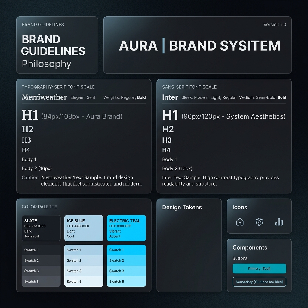
#### 1. Hardware-Aware Token Layers Stop hardcoding hex values. Modern accessible palettes use token layers that adapt to the hardware display mode: - **SDR Base Tokens:** Standard sRGB colors for older displays. - **HDR P3 Tokens:** Extended color gamut values (e.g., `color(display-p3 1 0 0)`) for modern screens. - **OLED Pure Black Layers:** Deep blacks (`#000000`) that turn off pixels entirely, paired with lowered-intensity text (e.g., 85% white) to prevent blooming.
#### 2. The Halation Effect & Dark Mode Typographic Thinning On dark backgrounds, bright text appears thicker due to light bleed (halation). If your dark mode contrast is too high, the text becomes unreadable. - **Do not use pure white (`#FFFFFF`) on pure black (`#000000`).** The contrast ratio is too extreme (21:1). - **The 2026 Standard:** Use `#E2E8F0` (Slate 200) or `rgba(255, 255, 255, 0.85)` on pure black. This maintains a healthy 14:1 perceptual ratio while eliminating eye strain. - **Variable Font Weight Adjustment:** Automatically reduce font weight by 50-100 points in dark mode using CSS: ```css @media (prefers-color-scheme: dark) { h1, h2, p { font-variation-settings: "wght" 400; } /* down from 500 */ } ```
#### 3. Color Ignorance & Shape Reliance Color blindness affects 8% of men and 0.5% of women. In 2026, it is considered a strict failure to rely solely on color to convey state. - **Error States:** A red border is not enough. You must include a high-contrast icon (e.g., an X or warning triangle) and a thick stroke. - **Focus States:** The focus ring must have at least a 3:1 contrast ratio against the background color. Do not rely on subtle drop shadows.
### Worked Example: Building an Accessible Button Component
Here is how a 2026 button is constructed using CSS custom properties (variables) mapped to accessible tokens:
```css /* Base Tokens (APCA compliant) */ :root { --btn-bg-light: #2563EB; /* Blue 600 */ --btn-text-light: #FFFFFF; --btn-focus-ring: #1D4ED8; /* Blue 700 */ }
@media (prefers-color-scheme: dark) { :root { --btn-bg-dark: #60A5FA; /* Blue 400 */ --btn-text-dark: #0F172A; /* Slate 900 (High contrast, prevents halation) */ --btn-focus-ring: #93C5FD; /* Blue 300 */ } }
.button-primary { background-color: var(--btn-bg-light); color: var(--btn-text-light); font-weight: 600; /* Robust spatial frequency */ outline-offset: 2px; }
.button-primary:focus-visible { outline: 3px solid var(--btn-focus-ring); } ```
### Testing Your Colors in 2026
Do not guess. Use modern testing tools: 1. **APCA Contrast Calculator:** Check your colors against the APCA Lc value (aim for Lc 60 for body text, Lc 45 for large headlines). 2. **Figma Color Blindness Plugins:** Simulate Protanopia and Deuteranopia directly on your artboards. 3. **Hardware Simulation:** Test your high-contrast modes on actual OLED devices at 100% brightness to check for halation.
### What to Read Next To see how these contrast rules apply to actual user interfaces, check out our [OLED Energy-Efficient UI Design Templates](/asset/energy-efficient-ui-design-oled-2026/). If you're building out a full brand, our [Brand Identity Selection Guide 2026](/asset/brand-identity-selection-guide-2026/) explains how to scale these accessible tokens across print and digital.
Directory Analysis & Suitability
Key Advantages
- Focuses on modern APCA modeling
- Specific CSS implementations for token states
- Explains OLED halation
Considerations
- Might be too technical for entry-level designers
Platform Compatibility
Web Environment
Exceptional
Mobile & Touch
Exceptional
Desktop Software
Exceptional