Prompt Engineering for Designers: The 2026 Guide to Creative Control
🍀 Directory Note
"Master the exact syntax, lighting terms, and negative prompts required to direct AI tools like a creative director."
About Prompt Engineering for Designers: The 2026 Guide to Creative Control
## Prompt Engineering for Designers: The 2026 Guide to Creative Control
**Short Answer:** In 2026, graphic designers no longer just push pixels; they direct AI models. Mastering prompt engineering means understanding how to use specific lighting terms, aspect ratios, negative prompts, and seed numbers to maintain strict brand consistency and visual excellence rather than accepting the generic output of default AI generation.
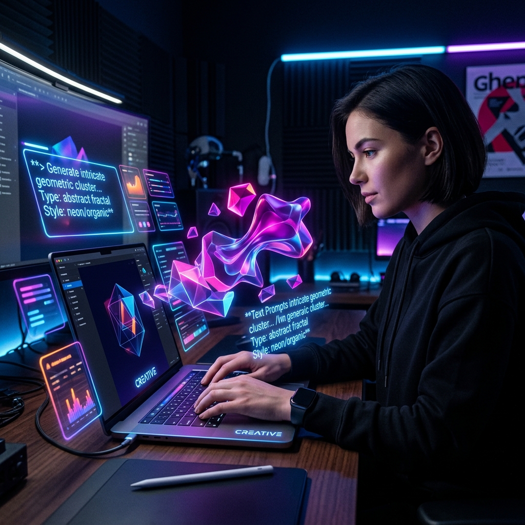
For years, many designers viewed AI generation tools like Midjourney or DALL-E as a threat. But the reality is that these tools are simply new rendering engines. The difference between an amateur output and a professional asset lies entirely in the prompt structure. Just as a creative director guides a photographer on a set, a designer in 2026 must precisely guide the AI.
If you just type "a cool logo," you will get a generic, unusable result. This guide breaks down the exact syntax required to generate premium, brand-aligned visual assets.
### 1. The Anatomy of a Professional Prompt
A professional prompt is not a sentence; it is a structured command set. The best results come from breaking your prompt into distinct, ordered parameters.
* **Subject:** What is the primary focus? (e.g., "A minimalist geometric logo for a tech company"). * **Medium & Style:** What is the specific aesthetic? (e.g., "Vector illustration, flat design, neo-brutalist"). * **Lighting & Color:** Crucial for consistency. (e.g., "Cinematic lighting, high contrast, neon cyan and deep purple accents"). * **Technical Parameters:** Controlling the output format. (e.g., "--ar 16:9 --v 6.0 --style raw").
### 2. Controlling Lighting and Texture
Lighting dictates mood more than any other element. Stop using words like "bright" or "dark" and use industry-standard terminology.
* **For Product Mockups:** Use terms like "studio lighting, softbox, rim light, highly detailed." * **For Environmental Context:** Use "volumetric lighting, golden hour, ray tracing." * **Texture:** If you want a non-AI feel, force texture into the prompt. Use "film grain, 35mm photography, ISO 400" for realism, or "risograph print, halftone dots, visible brushstrokes" for illustration.
For a deep dive into how these textures function at a computational level, check out [Reacit's AI tool analysis](https://reacit.com).
### 3. The Power of Negative Prompts
Negative prompts tell the AI exactly what *not* to do. This is your primary tool for removing the "AI look."
If you are generating a brand logo, your negative prompt should look like this: * `--no text, letters, watermark, 3d render, hyperrealistic, shadows, complex background`
By stripping away complexity, you force the AI to return a clean, usable vector-style asset.
### 4. Maintaining Consistency Across a Campaign
The hardest part of AI design is consistency. If you need three images for a campaign, they must look like they belong to the same family.
* **Seed Numbers:** When you generate an image you like, find its "seed number." By appending that exact seed to your next prompt (e.g., `--seed 123456`), the AI will use the same foundational noise pattern, ensuring a very similar stylistic outcome. * **Style References:** Use the `--sref` parameter in advanced models to point the AI to a specific image URL. The AI will adopt the colors and rendering style of the reference image without copying the subject.
### 5. Legal and Copyright Realities
While the tools are powerful, the legal landscape is complex. In 2026, AI-generated images generally cannot be copyrighted. Therefore, smart designers use AI for ideation, mood boards, and complex backgrounds, while ensuring the core brand mark (the logo itself) is manually vectorized and modified to establish human authorship.
The principles of good design - balance, hierarchy, and harmony - remain unchanged. The tools have simply shifted. (These principles apply universally; just as we balance a composition on a screen, we balance physical environments, as seen in [Lucky.properties interior space harmony guides](https://lucky.properties)).
**What to Read Next:** [Color Psychology in Brand Design: The 2026 Update](/articles/color-psychology-brand-2026)
Directory Analysis & Suitability
Key Advantages
- Teaches precise control over lighting and texture
- Focuses on professional, non-generic outputs
- Addresses legal and consistency realities
Considerations
- Requires adaptation as AI models update
Platform Compatibility
Web Environment
Exceptional
Mobile & Touch
Excellent
Desktop Software
Exceptional