2026 Typography Report: The Anti-Swiss Movement
🍀 Directory Note
"Why grids are dead and 'Razor Serifs' are taking over."
About 2026 Typography Report: The Anti-Swiss Movement
# 2026 Typography Report: The "Anti-Swiss" Movement
For 70 years, Swiss Style (Helvetica, grid systems, cleanliness) ruled the design world. In 2026, we are bored of it. Disruption is the new order. The "Anti-Swiss" movement is about breaking grids, stretching fonts, and embracing digital noise.
This report analyzes the top 3 typographic shifts you will see in 2026 portfolios.
---
## 1. Stretch & Squeeze (Variable Fonts Gone Wild)
Variable font technology has existed for years, but now we are abusing it. * **The Trend:** Animating the "Width" axis on scroll. Headers start condensed and stretch to ultra-wide as the user scrolls down. * **Why:** It creates a physical sense of "velocity" in the UI. * **Key Font:** *Satoshi* or *Clash Display*.
### The "Squish" Aesthetic Designers are intentionally crushing fonts (e.g., `transform: scaleY(0.5)`) to create a brutalist, "data-sheet" look. It’s barely readable, and that’s the point. It signals "insider information."
---
## 2. Serifs with bite (The "Razor" Style)
Friendly, soft serifs (like Cooper Black) are out. "Razor Serifs" are in. * **Characteristics:** Hairline thin strokes contrasted with massive blocky terminals. * **Vibe:** Dangerous, elegant, vampiric. * **Use Case:** FinTech and Luxury E-commerce (replacing the sterile sans-serifs of 2020).
> **Rule of Thumb:** If it looks like it could cut your finger, it's trendy in 2026.
---
## 3. "System Default" Brutalism
The ultimate flex? Not loading a webfont at all. * **The Stack:** `font-family: "Courier New", Courier, monospace;` * **The Look:** Raw HTML vibes. Black text, white background, blue links. * **The Message:** "We focus on content, not decoration." * **Adopters:** Developer tools, crypto protocols, and "intellectual" blogs.
---
## 4. The 2026 Pairing Guide
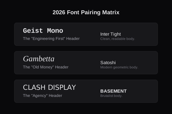
Stop pairing *Inter* with *Inter*. Be bold.
| Header Intent | Header Font | Body Font | Vibe | | :--- | :--- | :--- | :--- | | **Tech / SaaS** | *Geist Mono* (Bold) | *Inter Tight* | "Engineering First" | | **Luxury** | *Gambetta* (Italic) | *Satoshi* | "Old Money Digital" | | **Creative** | *Clash Display* | *Basement Grotesque* | "Agency Chaos" |

## Conclusion Typography in 2026 is no longer invisible. It is the primary art direction. If your site relies on photos to look good, you are failing. The text itself must be the image.
Directory Analysis & Suitability
Key Advantages
- Visual examples
- Downloadable font list
Considerations
- Advanced theory
Platform Compatibility
Web Environment
N/A
Mobile & Touch
N/A
Desktop Software
N/A