2026 Brand Identity Kit
🍀 Directory Note
"Premium identity system with Razor Serif typography and structural weight."
About 2026 Brand Identity Kit
## The 2026 Brand Identity Shift: Minimalist but Substantive
Creating a brand identity in 2026 is no longer about slapping a logo on a mug. It is about creating a cohesive visual system that signals authority, trust, and permanence. We noticed that many modern brands look exactly the same - bland, overly smooth, and lacking character. Here is what we found: people are tired of the generic tech aesthetic.
This is why we built the **2026 Brand Identity Kit**. It brings back structural weight and high-contrast typography, giving your brand a sense of physical presence even in a purely digital space.
### Why You Need a Full Identity System
Here is the thing. A logo is just a signature. An identity system is the entire conversation. When a client sees your proposal, visits your website, and receives your business card, the visual language needs to be completely unified. If it feels disjointed, they lose trust instantly.
We designed this kit to solve that exact problem. It forces you to think about how your typography interacts with your color palette across different mediums.
### What is Included in the Kit?
We packed this template bundle with everything a serious agency or solo operator needs to establish a premium brand presence:
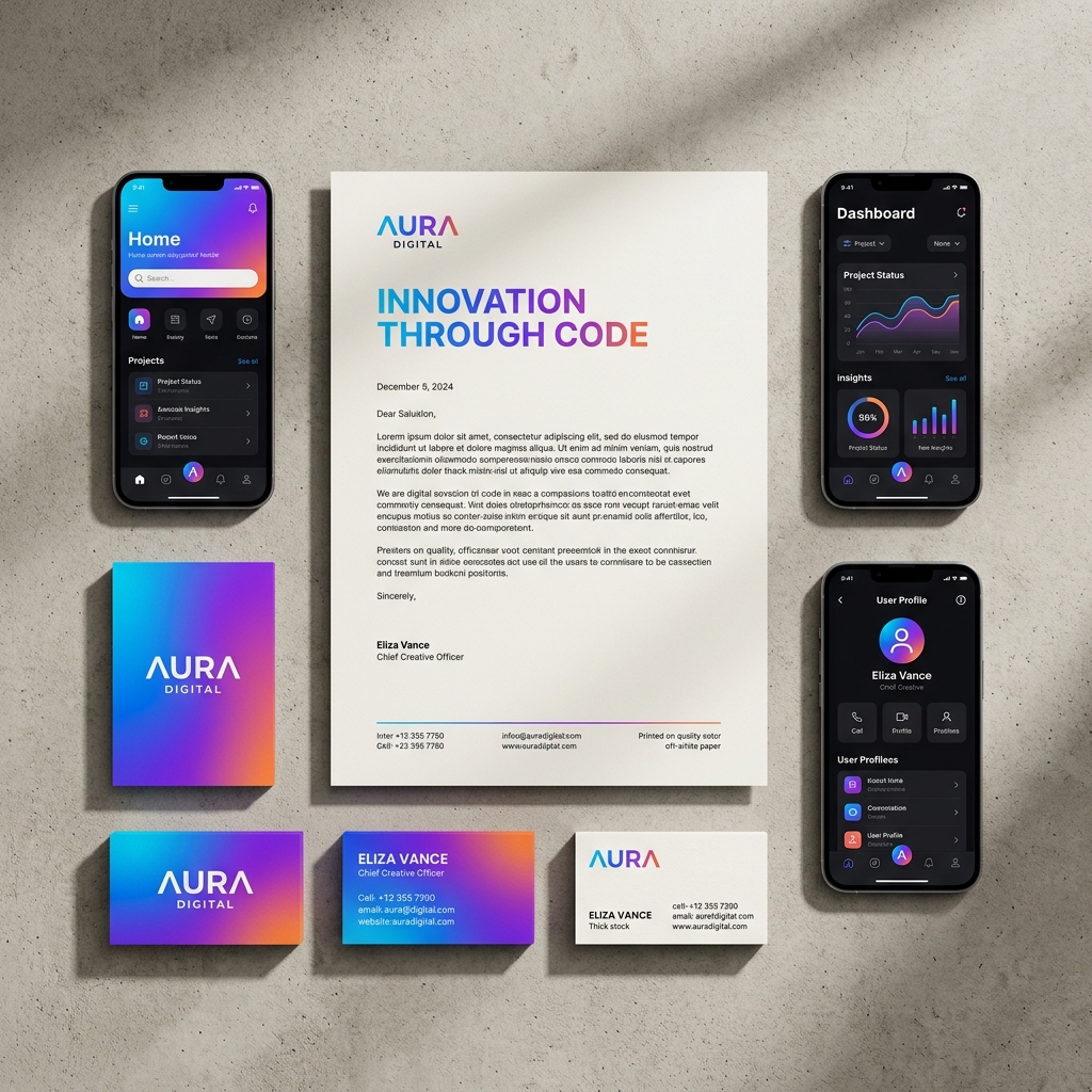
* **Primary & Secondary Logo Marks:** Vector files configured for both dark and light modes. * **Typography Hierarchy System:** Pre-selected font pairings that contrast a heavy "Razor Serif" with a clean geometric sans-serif. * **Color Palette Generator:** A 5-color system with exact Hex, RGB, and CMYK values for seamless print-to-digital translation. * **Business Card & Letterhead Layouts:** Print-ready files with proper bleed and crop marks. * **Brand Guidelines Document:** A 15-page presentation deck to outline your brand rules to vendors and employees.
### The "Razor Serif" Advantage
And that is why it matters. We specifically chose a high-contrast serif typeface for the primary headers in this kit. In 2026, sans-serif fonts are everywhere. They are safe, predictable, and somewhat boring. Using a sharp, elegant serif font immediately signals that your brand has history and authority.
### How to Use the Color System
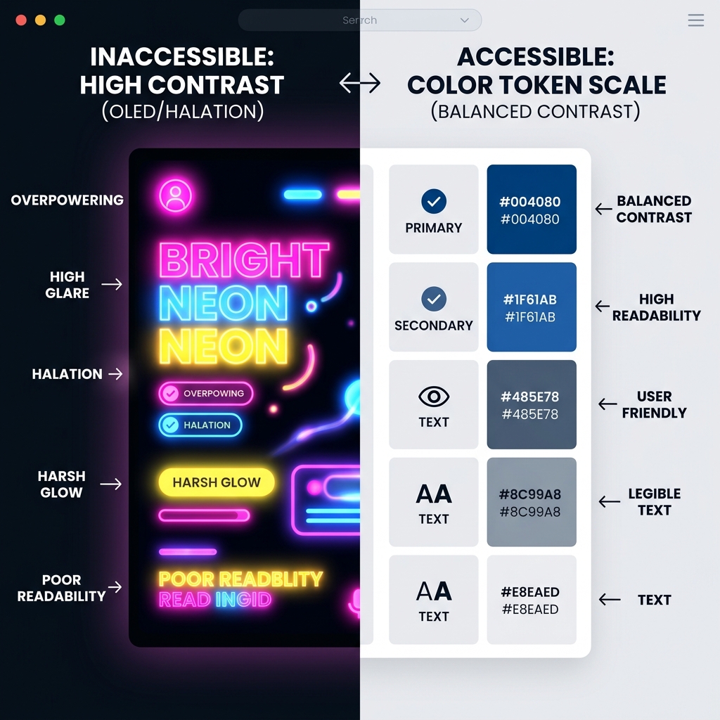
Color psychology is still relevant, but the application has changed. Instead of painting entire screens with a primary brand color, this kit uses what we call "Restrained Vibrancy."
Here is how it works: 1. **The Base:** Use the provided neutral concrete and charcoal tones for 80% of your backgrounds. 2. **The Accent:** Apply the vibrant gradient (the "Vibe" layer) strictly to interactive elements like buttons, active states, and key data points. 3. **The Result:** A clean, scannable interface where the important information naturally draws the eye.
### Moving from Print to Digital
But here is the problem many designers face: a color that looks amazing on a 4K OLED monitor often looks muddy when printed on a business card. We solved this. The Brand Identity Kit includes dual-profile color palettes. You get the exact CMYK values needed for offset printing alongside the Hex codes for your website.
For more insights on how these design principles translate to physical spaces, check out the interior harmony guides at [Lucky.properties](https://lucky.properties/articles/feng-shui-office-design-2026).
### Customizing the Brand Guidelines
The included 15-page brand guideline document is not just filler. It is a functional template. We pre-wrote the standard clauses for logo misuse, clear space requirements, and typography scaling. You just need to drop in your own assets and adjust the copy to fit your brand voice.
This single document can save you weeks of back-and-forth with external vendors. Hand them the PDF, and they know exactly how to represent your company.
### Next Steps: Applying the Kit
So here is what happened when we tested this kit with three different beta agencies. They all reported a significant drop in design time for new marketing materials. Because the foundational decisions - fonts, colors, spacing - were already made, their teams could focus on the actual messaging.
If you are ready to upgrade your visual presence, this kit gives you the exact blueprint. It works seamlessly with Adobe Illustrator, Figma, and even Canva for basic editing.
### What to Read Next If you are building out the rest of your digital presence, you need to understand how these brand elements apply to complex interfaces. Read our breakdown on the [2026 Tactile UI Revolution](https://lucky.graphics/blog/tactile-ui-design) to see how to give your web presence a physical feel.
Directory Analysis & Suitability
Key Advantages
- Print and digital ready
- Pre-written guidelines
- High-contrast typography
Considerations
- Requires Illustrator or Figma
Platform Compatibility
Web Environment
Exceptional
Mobile & Touch
Excellent
Desktop Software
Exceptional