Color Psychology in Brand Design 2026
🍀 Directory Note
"The shift to high-frequency aesthetics and managing emotional resonance in HDR."
About Color Psychology in Brand Design 2026
## Color Psychology in Brand Design: The 2026 High-Frequency Shift
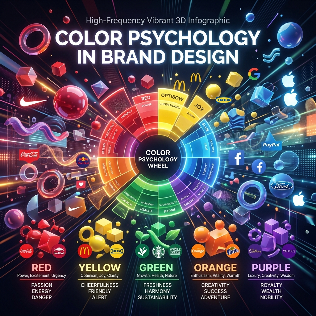
**Short Answer:** Color psychology is no longer just about "blue means trust." In 2026, color must be optimized for High Dynamic Range (HDR) displays, dark mode contrast accessibility, and emotional resonance in high-stress digital environments.
Here's the thing: If you are still referencing color psychology charts from 2015, you are losing your audience. The hardware has changed. OLED screens and 8K HDR displays render color with such intensity that traditional brand colors often become blinding or aggressive in digital formats. Furthermore, user anxiety is at an all-time high. The colors you choose must manage the user's emotional state, not just scream for attention.
### The Death of "Corporate Blue"
For twenty years, every tech company, bank, and insurance firm used the same desaturated "Corporate Blue" because it signaled safety, security, and trust.
In 2026, Corporate Blue signals bureaucracy, legacy tech, and boredom.
Modern brands are pivoting. They are adopting **High-Frequency Aesthetics** - colors that feel vibrant, energetic, and slightly alien. Think electric indigos, hyper-pigmented corals, and bioluminescent greens. These colors don't just ask for trust; they demand attention and signal that the brand is operating at the cutting edge of the digital frontier.
### The Psychology of Modern Palettes
How do specific color ranges manipulate user emotion in modern interface design?
#### 1. The Bioluminescent Greens & Cyans (The New Tech) * **The Vibe:** AI, Web3, autonomous systems, and synthetic biology. * **The Psychology:** It feels like looking at a terminal screen in a sci-fi movie. It signals that the product is highly intelligent and slightly dangerous. It is the color of the "Matrix," updated for 2026. * **Best Used For:** Developer tools, AI platforms, and cybersecurity products.
#### 2. The Hyper-Warm Oranges & Corals (The Human Element) * **The Vibe:** Tactile energy, physical movement, and human warmth. * **The Psychology:** In a digital world dominated by cold glassmorphism, hyper-warm colors feel like a physical embrace. They stimulate action and physical engagement. * **Best Used For:** Fitness apps, food delivery, and community-driven platforms.
#### 3. Deep Obsidian & Void Blacks (The Luxury of Silence) * **The Vibe:** Premium authority, absolute confidence, and quiet luxury. * **The Psychology:** Bright white interfaces feel cheap and loud. Pure black (specifically #000000 on OLED screens, which turns the pixels entirely off) signals that the brand doesn't need to shout. It is confident enough to let the content breathe in the dark. * **Best Used For:** High-end fashion, premium financial tools, and forensic dashboards. (For a masterclass in this aesthetic, see our [2026 Cyberpunk Dashboard System](/asset/cyberpunk-dashboard-system-2026/)).
### The Accessibility Imperative (WCAG 3.0)
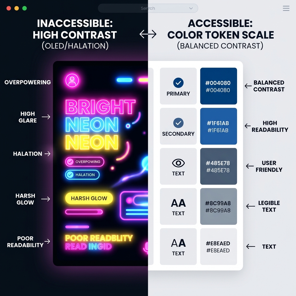
You cannot discuss color psychology without discussing accessibility. The emotional impact of a color is irrelevant if the user cannot read the text.
In 2026, dynamic color systems are standard. Your brand cannot have just one "Primary Red." It needs a Light Mode Red (darker, for contrast against white backgrounds) and a Dark Mode Red (lighter and more vibrant, to glow against black backgrounds).
Failing to adjust your color saturation for dark mode results in "vibrating edges" - a harsh visual effect that causes instant eye strain and a spike in user frustration.
### Contextual Color (The Cultural Shift)
Finally, remember that color psychology is highly cultural and contextual. Red means danger in Western finance, but it means wealth and luck in many Asian markets. When designing globally, your color system must be culturally aware.
**What to Read Next:** To see how these high-frequency colors are applied in the real world to combat AI-generated smoothness, read our report on [Visual Marketing 2026: The Rise of Authenticity](/asset/visual-marketing-2026-trends/).
Directory Analysis & Suitability
Key Advantages
- Hardware-aware color theory
- Dark mode accessibility rules
Considerations
- Theoretical rather than actionable template
Platform Compatibility
Web Environment
Exceptional
Mobile & Touch
Exceptional
Desktop Software
Exceptional