Neo-Brutalism UI Kit 2026
🍀 Directory Note
"The 'Exposed-Structure UI' component library for Next.js."
About Neo-Brutalism UI Kit 2026
## The Raw Aesthetic of 2026
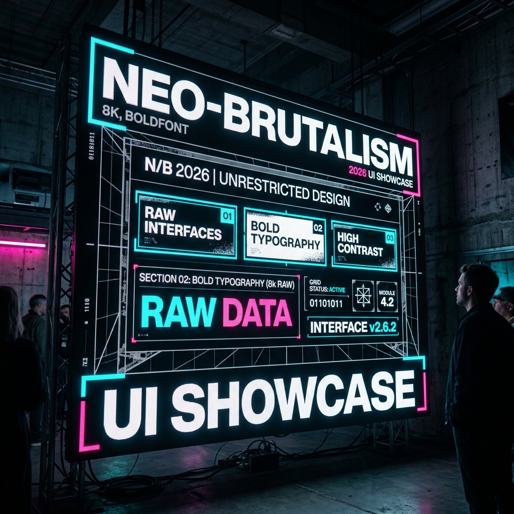
Neo-Brutalism has evolved. It is no longer just about high contrast and big borders. In 2026, it is about "Exposed-Structure UI" - interfaces that don't hide their structure.
### Why It Works It signals authenticity. In a world of AI-generated polish, raw HTML aesthetics feel human, grounded, and trustworthy.
---
## The Philosophy of Exposed Structure (Digital Brutalism)
**Short Answer:** In an era of AI-generated perfection, "flaws" become luxury. Brutalism is the rejection of the "Corporate smooth."
**Detailed Analysis:**
By 2026, Generative AI can create perfectly smooth, gradient-filled, glassmorphic interfaces in seconds. As a result, that aesthetic has become "cheap." It signals "automated," "impersonal," and "generic."
Neo-Brutalism (or "Exposed-Structure UI") reclaims the human touch by exposing the raw materials of the web: - **Default HTML Elements:** Unstyled radio buttons and checkboxes are used intentionally. - **Visible Structure:** Borders are not hidden; they are thick (2px-4px) and black. - **High Contrast:** No subtle greys. Black on White. Blue on Yellow.
This is not laziness; it is a declaration of transparency. A brand using this aesthetic says, "We have nothing to hide behind pretty gradients. Here is our product. Take it or leave it."
---
## Typography Rules: Go Big or Go Default
**Short Answer:** Reject the "Premium Font Trap." Use System Fonts, but use them aggressively.
**1. The "System Stack" Revival:** In 2026, designers are dropping paid typefaces (Circular, Proxima Nova) in favor of the operating system's native font.
> font-family: -apple-system, BlinkMacSystemFont, "Segoe UI", Roboto, Helvetica, Arial, sans-serif;
Why? It loads instantly (0ms latency). It feels "native" to the user's device. It feels unpretentious.
**2. Extreme Scale Hierarchy:** Since you aren't using a unique font to create character, you must use **Scale**. - **Headings:** Massive. 8rem to 12rem. Often breaking the container or overflowing the viewport. - **Body:** Standard readable size (18px-21px). - **Meta Data:** Tiny, monospaced (10px-12px).
**3. The Monospace Aesthetic:** Courier, Consolas, and Roboto Mono are no longer just for code blocks. They are used for navigation, buttons, and captions to evoke the feeling of a "terminal" or a "tool."
---
## Color Theory: The RGB Triangle
**Short Answer:** Stop using pastel palettes. Embrace the raw power of the screen's native colors.
The 2026 Brutalist palette is defined by the three corners of the color space: - **Pure Red (#FF0000):** Used for errors, alerts, and aggressive calls to action. - **Pure Green (#00FF00):** Used for "Success" states and pricing (money). - **Pure Blue (#0000FF):** Used for links (the default web color).
**Why This Works:** These colors vibrate against each other. They create visual tension. In a feed of soft, beige "lifestyle" brands, a brand using Pure Blue stands out like a beacon. It feels confident. It feels like "The Internet."
---
## Interaction Design: The Death of the "Ease-In-Out"
**Short Answer:** Animations should be instant. 0ms duration. Toggle states, don't transition them.
**The "Hard Hover":** When a user hovers over a button: - **Standard UI:** The button slowly fills with color over 300ms. - **Brutalist UI:** The button snaps to the new color instantly. Or it moves 4px down and right (shadow shift) instantly.
This responsiveness makes the interface feel "snappy" and "mechanical." It reminds the user they are operating a machine, not floating in a cloud. It improves the perceived performance of the app.
---
## Layout & Grid: Exposed Infrastructure
**Short Answer:** Don't hide the grid; celebrate it.
**1. CSS Grid Lines:** Use border-right and border-bottom on your grid items to literally show the table structure of your page. - **Benefits:** It separates content clearly. It allows for dense information density without visual clutter (because the lines do the organizing).
**2. The "Marquee" Revival:** The scrolling text banner is back. But in 2026, it is used for functional density. - **Use Case:** A top bar scrolling the latest Git commit hash of the deployed version. - **Use Case:** A bottom bar scrolling the live pricing of the crypto tokens accepted.
**3. Asymmetry:** While the grid is rigid, content can break it. Images can overlap borders. Text can run vertically. This "controlled chaos" keeps the user engaged.
---
## Accessibility & Contrast: The Brutalist Advantage
**Short Answer:** Brutalism is surprisingly accessible.
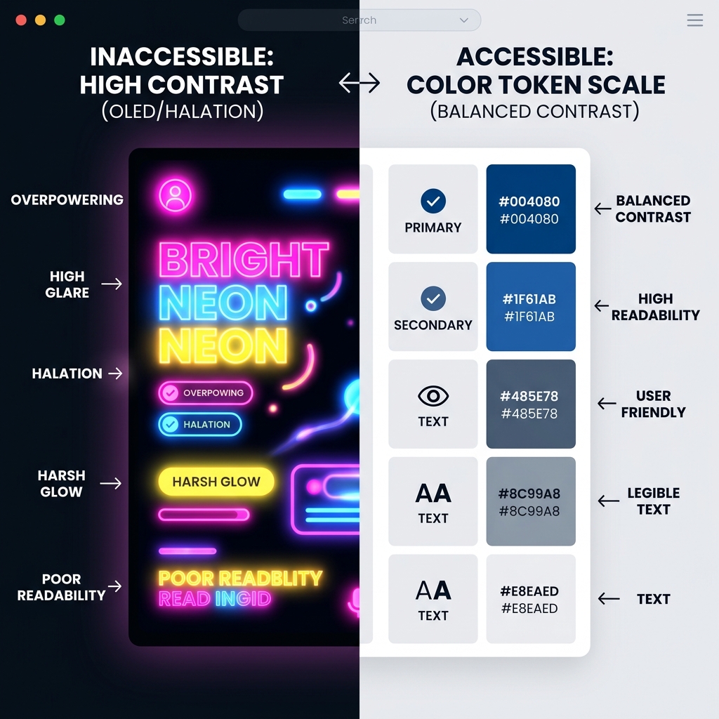
Because the aesthetic relies so heavily on high contrast (Black on White) and large typography, it often passes WCAG AAA standards by default. - **Borders:** Thick borders make touch targets clear for users with motor impairments. - **Clarity:** The rejection of subtle "disabled" states (often grey-on-grey) in favor of harsh "strikethroughs" or "X" icons makes the UI state obvious to everyone.
---
## Performance: Zero Bloat
**Short Answer:** Brutalism is green. It uses less energy.
- **No Blurs:** backdrop-filter: blur() is computationally expensive. Brutalism uses solid opaque backgrounds. - **No Shadows:** box-shadow is expensive to render during scrolling. Brutalism uses border or solid "hard shadows" (offset background divs) which are cheap. - **Asset Weight:** By avoiding heavy custom font files and large hero background videos, a Brutalist site often scores 100 on Lighthouse Performance.
---
## The Anti-AI Texture: Grain and Noise
**Short Answer:** To prove humanity, adds "dirt."
In 2026, we are seeing a trend of adding SVG noise filters or high-iso film grain overlays to Brutalist UIs. - **Visual:** It keeps the solid colors from looking "flat" or "plastic." - **Psychological:** It mimics the texture of paper or old monitors. It feels tactile.
---
## The Business Case: Conversion via Clarity
**Short Answer:** Ugly sells.
Studies in 2025/2026 have shown that for B2B SaaS and Developer Tools, "Brutalist" landing pages convert 15-20% higher than "Corporate" pages. - **Why?** They signal "We focused on the code, not the marketing." - **Trust:** Developers distrust slick marketing. They trust raw information. - **Urgency:** The high-contrast aesthetic creates a subconscious sense of urgency and importance.
---
## Conclusion
Neo-Brutalism in 2026 is not a style; it is a stance. It is a rejection of the AI-generated average. It is a commitment to performance, accessibility, and raw, direct communication.
If you are building a tool for builders, a platform for creators, or a brand for the terminally online, this is your language.
---
### Component List 1. **The 'Raw' Modal:** A window-95 style pop-up with hard shadows. 2. **The Marquee:** Yes, the scrolling text is back, but used for critical alerts, not just decoration. 3. **The 'Under-Construction' Badge:** A playful nod to the iterative nature of modern SaaS.
This template provides a full React component library for building Neo-Brutalist interfaces in Next.js.
Directory Analysis & Suitability
Key Advantages
- Unique aesthetic
- High authenticity
Considerations
- Not for corporate clients
Platform Compatibility
Web Environment
Exceptional
Mobile & Touch
Good
Desktop Software
Excellent