2026 Social Analytics Dashboard UI
🍀 Directory Note
"Premium dark-mode glassmorphism dashboard for data heavy applications."
About 2026 Social Analytics Dashboard UI
## The 2026 Social Media Analytics Dashboard
Building a dashboard interface that is both beautiful and functional is notoriously difficult. Usually, you have to sacrifice one for the other. You either end up with a gorgeous UI that is impossible to read, or a highly functional spreadsheet that looks like it was built in 1995.
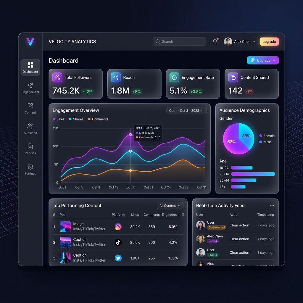
We decided to fix this. The **2026 Social Analytics UI Template** provides a premium, dark-mode glassmorphism framework that presents complex data with absolute clarity.
### The Problem with Data Overload
But here is the problem. Modern social media managers track dozens of metrics across multiple platforms. Engagement rates, reach velocity, conversion attribution - it is a massive amount of data. When you display all of this at once, the user experiences cognitive overload.
This template solves that by implementing "Progressive Disclosure." The main dashboard only shows high-level trends. The user has to actively click or hover to reveal the granular data points.
### Key Features of the UI Kit
This kit is not just a pretty picture; it is a functional component library designed for React and Vue environments.
* **Glassmorphic Data Cards:** Semi-transparent panels with background blur, providing depth without distracting from the data. * **Dynamic Line Graphs:** Pre-styled chart components that use glowing neon accents to highlight positive trends. * **Biometric Navigation:** A sidebar structure optimized for rapid, muscle-memory navigation. * **Dark Mode Native:** Built from the ground up for dark mode, reducing eye strain for professional operators.
### Why Dark Mode is Mandatory in 2026
Here is the thing. Dark mode is no longer an optional toggle; it is the default expectation for professional software. When someone is staring at analytics for eight hours a day, a glaring white screen is a massive friction point.
Our dark mode implementation does not just use pure black. We use deep charcoal and midnight blues as the base layers. This allows the vibrant data colors - cyan, magenta, and lime green - to achieve maximum contrast without causing visual fatigue.
### Integrating with Backend Systems
This might work for you. We designed these components to map perfectly to standard JSON data structures. Whether you are pulling data from the Twitter API, Meta Graph API, or a custom backend, the UI cards are built to handle variable text lengths and null data states gracefully.
If you are building the backend infrastructure for this type of application, you should review the agentic workflow models discussed over at [Reacit.com](https://reacit.com) for ideas on data pipeline optimization.
### The Power of the "Glow"
And that is why it matters. In a flat UI, everything has the same level of importance. By introducing subtle glowing effects to the data visualization elements, we create an immediate visual hierarchy.
A spike in engagement is not just a taller bar on a chart; it is a brighter, glowing bar that demands attention. This is what we call "Haptic Feedback for the Eyes." It allows the operator to spot anomalies in the data in a fraction of a second.
### Responsive Behavior
A dashboard must work on a laptop, but it also has to be readable on a phone when a manager is checking stats during a commute.
We built a strict grid system that automatically reflows the data cards. On desktop, you see a 4-column layout. On tablet, it shifts to 2 columns. On mobile, it stacks vertically, but the charts dynamically scale their aspect ratios so the data lines remain legible.
### Customizing the Theme
You are not locked into our color palette. The entire template uses CSS variables (or Figma variables, depending on your tool). Change the primary brand color in one place, and the entire dashboard - including the chart gradients and hover states - updates instantly.
### What to Read Next If you want to understand the design theory behind these interface decisions, read our comprehensive report on the [Tactile UI & Haptic Design Revolution](https://lucky.graphics/blog/tactile-ui-design) shaping 2026.
Directory Analysis & Suitability
Key Advantages
- Progressive disclosure
- Haptic visual feedback
- Dark mode native
Considerations
- Not suited for light mode
Platform Compatibility
Web Environment
Exceptional
Mobile & Touch
Excellent
Desktop Software
Exceptional