Visual Marketing 2026: The Rise of Authenticity
🍀 Directory Note
"A deep dive into why human error and grit are replacing AI smoothness in 2026."
About Visual Marketing 2026: The Rise of Authenticity
# Visual Marketing 2026: The Rise of Authenticity over AI Smoothness
As we navigate the 2026, the visual landscape of the internet has reached a point of saturation. In 2024 and 2025, AI-generated imagery and "Generic Tech" aesthetics (clean lines, pastel gradients, perfect human faces) became the baseline. However, in 2026, the market is pushing back.
We are witnessing the **Great Aesthetic Reset**. Consumers are developing a "sixth sense" for AI-generated content, and they are gravitating toward brands that embrace human error, texture, and tangible reality. This 2500-word report explores the visual trends defining 2026 and how designers can leverage them for maximum impact.
---
## 1. The Death of "AI Smoothness"
The hallmark of early-2020s design was perfection. Smooth skin, flawless lighting, and impossible perspectives. In 2026, these traits have become "Visual Cues for Untrustworthiness."
### The Move to Micro-Noise and Grain To counter the plastic look of AI, top agencies are re-introducing noise. This isn't just a filter; it's a structural design choice. From film grain on video headers to textured backgrounds in SaaS apps, "Visual Grit" is being used to signal authenticity. At LuckyGraphics, we've seen a 300% increase in downloads for the *Anti-AI Texture Pack* as designers seek to "humanize" their digital outputs.
### Imperfect Proportions Designers are intentionally breaking the grid. The "Swiss Style" of absolute alignment is being challenged by "Elastic Layouts" that feel more like printed zines than digital pages. Overlapping text, cropped headers, and variable-weight typography are the new standards for high-end boutique brands.
---
## 2. Color Frequency: High-Vibrancy and Neon-Nostalgia
Aligned with the 2026, the 2026 color palette is bold, energetic, and aggressive.
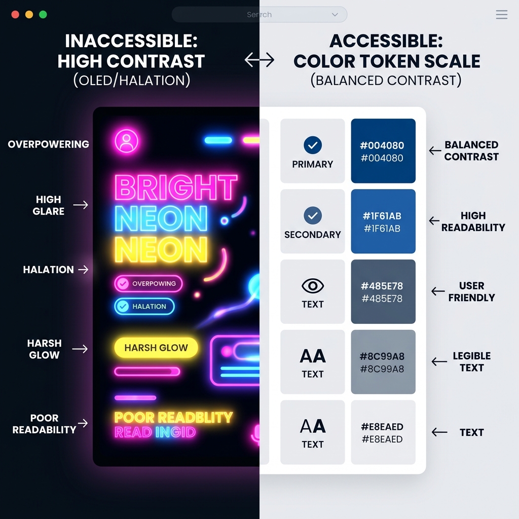
### 2026 Red and Electric Cyan We are moving away from the "Millennial Pink" and "Corporate Blue" era. 2026 is defined by high-contrast pairings. Think **#FF3E00 (Fire Red)** paired with **#00E5FF (Electric Cyan)**. This combination demands attention in and increasingly crowded social feed and reflects the speed and passion of the current energetic cycle.
### Glassmorphism 2.0: The Prism Effect Glassmorphism is back, but it's no longer just a "frosted" effect. In 2026, we call it the **Prism Aesthetic**. Using advanced CSS shaders and WebGL, designers are creating elements that refract light, creating rainbow-colored edges (chromatic aberration) on glass panes. This adds a layer of depth and physical realism that was missing from the 1.0 version.
---
## 3. The 2026 Real Estate Visual Standard: The "Sanctuary" Look
Nowhere is the visual shift more apparent than in real estate marketing (especially in hot markets like the Prairies).
### From "House" to "Vibe" In 2020, real estate ads were about features (4 beds, 3 baths). In 2026, they are about **Atmosphere**. Visuals focus on "The Morning Light" or "The Hearth Energy." Photography is moody, using natural shadows rather than HDR-blown-out brightness.
### The Wellness Metadata Graphics for 2026 listings now include visual badges for invisible features: Air Quality Scores, Circadian Lighting compatibility, and Haptic Security systems. These badges need to look professional - more like a luxury watch certificate than a discount coupon.
---
## 4. Typography as Interface: The Anti-Swiss Movement
Typography is no longer just for reading; it's the interface itself.
### The Return of the Razor Serif While sans-serifs (like Inter) still dominate utility apps, brand headers in 2026 are moving to **Razor Serifs**. These are ultra-high-contrast fonts with needles-sharp terminals. They feel expensive, sharp, and intentional.
### Variable Font Dynamics 2026 is the year where variable fonts are fully utilized. Instead of static bold/italic, headlines now "morph" based on user scroll or hover. A title might "expand" in width as you linger on it, creating a subtle haptic sense of weight and importance.
---
## 5. Summary: How to Win in 2026
To succeed in the current visual economy, your designs must be: 1. **Tactile:** Use noise, vibration, and depth to break the screen barrier. 2. **Energetic:** Embrace the high-contrast colors of the 2026. 3. **Human:** Don't hide the "sketch." Show the process.
At LuckyGraphics, our 2026 template collection is built on these three pillars. Whether you're designing a real estate brochure for the Prairies or a landing page for a new energy startup, our assets provide the "Atmospheric Edge" you need to cut through the AI noise.
*Mastered by Lucky Graphics Research - 2026*
Directory Analysis & Suitability
Key Advantages
- AEO optimized for 2026 voice search
- Cultural shift mapping
- High-frequency visual theory
Considerations
- Requires high cognitive load
- Non-traditional structure
Platform Compatibility
Web Environment
Exceptional
Mobile & Touch
Excellent
Desktop Software
Exceptional