Brand Identity Selection Guide 2026
🍀 Directory Note
"A modern guide to selecting hardware-aware colors, variable typography scales, and unified brand design tokens."
About Brand Identity Selection Guide 2026
# The 2026 Brand Identity Selection Guide: Building Visual Sovereignty
**Short Answer:** Selecting a brand identity in 2026 requires balancing high-contrast digital interfaces with tactile, organic textures that signal human origin. To build a lasting identity, prioritize hardware-aware color palettes, variable typography hierarchy, and a centralized token system that adapts seamlessly across dark-mode screens, print stock, and AR environments.
Here's the thing: In an era where AI can generate millions of clean, generic layouts in seconds, the role of a brand identity has shifted. Cleanliness and perfection are no longer luxury signals. They are commodities. To stand out, brands are embracing what design theorists call "Visual Sovereignty" - an intentional assertion of human craft, authenticity, and emotional resonance. This guide breaks down the core pillars of selecting and building a modern brand identity.
---
## The Psychology of Color in high-LOD Interfaces
Color selection is no longer just about choosing three complementary swatches. In 2026, color theory is hardware-dependent. With the ubiquity of high-LOD (Level of Detail) OLED displays and HDR (High Dynamic Range) screens, colors display with unprecedented luminance and saturation. This technological shift has altered how users react to brand palettes.
### HDR vs. SDR Palette Planning
Traditional SDR (Standard Dynamic Range) palettes often look washed out on modern screens. However, simply pushing colors to maximum saturation creates eye strain and ruins readability. The key is planning for luminance contrast.
When choosing your brand colors, specify separate color coordinates for SDR and HDR environments. A vibrant royal blue that looks striking on an OLED iPhone might clip or shift on an older laptop screen. By defining distinct sRGB, Display P3, and Rec. 2020 color values in your brand kit, you guarantee that your visual identity remains consistent across all hardware tiers.
### The Emotional Resonance of Saturation
High-frequency, saturated colors are excellent for grabbing attention in crowded social feeds, but they fail to build long-term trust. For financial institutions or medical brands, lower-saturation palettes with deep, grounding tones are essential.
Conversely, creative studios and tech companies can leverage high-frequency accents to signal innovation. The rule of thumb is to use a 60-30-10 distribution: * **60% Dominant Tone:** A neutral, grounding color (such as a warm off-white or deep charcoal) that provides the canvas. * **30% Secondary Tone:** A structural color (like a muted sage or slate blue) that establishes the brand's personality. * **10% Accent Tone:** A high-frequency, saturated color (such as electric amber or bioluminescent green) reserved strictly for calls to action.
### Dark Mode Adaptations and Contrast Ratios
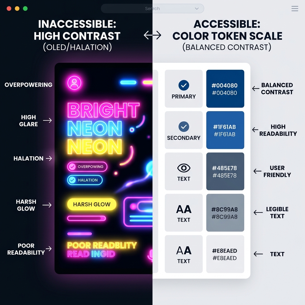
A modern brand identity must be dark-mode native. Do not simply invert your light-mode colors. When light colors are placed on a pure black background, they suffer from "halation" - a visual effect where the text appears to glow and blur, causing eye fatigue.
To prevent this, reduce the luminance of your brand colors by 10% to 15% when adapting them for dark mode. Ensure all text combinations satisfy the [W3C Web Content Accessibility Guidelines (WCAG)](https://www.w3.org/WAI/) contrast ratio of at least 4.5:1 for normal text and 3:1 for large text. This compliance is not just an accessibility requirement; it directly impacts your site's SEO performance and reader engagement.
---
## Typography Hierarchy: Selecting Fonts that Speak
Typography is the physical voice of your brand. In 2026, the rise of variable fonts has revolutionized typographic hierarchy, allowing designers to adjust font weight, width, and optical size dynamically based on screen resolution and user preferences.
### Defining the Typographic Scale
A structured typographic scale ensures that your content remains readable and scannable across all screen sizes. Your scale should define clear relationships between headers (H1, H2, H3), subheaders, body copy, and captions.
For modern technical layouts, a geometric scale (such as a Major Third or Perfect Fourth) provides a clean, mathematical progression. For example, using a Major Third scale with a 16px body font yields: * **Body Copy:** 16px (Line-height: 1.5) * **H3 Header:** 25px (Line-height: 1.3) * **H2 Header:** 31px (Line-height: 1.2) * **H1 Header:** 39px (Line-height: 1.1)
Ensure your CSS uses relative units (`rem` or `em`) rather than absolute pixels (`px`) to allow the scale to adapt to user browser settings.
### Serif vs. Sans-Serif: The Trust Factor
The choice between serif and sans-serif fonts dictates the emotional tone of your communication. Sans-serif fonts (like Inter or Satoshi) signal utility, modernism, and clarity. They are the default choice for software interfaces and high-frequency dashboards.
Serif fonts (like Instrument Serif or editorial display serifs) convey history, authority, and literary weight. In 2026, we are seeing a massive resurgence in serif typography as brands seek to distance themselves from the clinical, sterile aesthetic of the early 2020s. Using a high-contrast serif for H1 headers combined with a clean, highly legible sans-serif for body copy creates a balanced, premium aesthetic that builds immediate credibility.
### Variable Font Performance and Loading Speed
While custom fonts elevate your brand, they can destroy your site's loading speed if managed poorly. Every font file you load adds HTTP requests and increases your Largest Contentful Paint (LCP) metric.
To optimize performance, leverage variable fonts. A single variable font file contains all weights (from thin to black) and styles, yet its file size is often smaller than loading three separate static font files. Always self-host your font files rather than relying on external CDNs, and use modern formats like WOFF2. Specify `font-display: swap` in your CSS to prevent layout shifts during page load, ensuring a smooth user experience.
---
## Logo Guidelines: Vector Properties and Scalability
A logo is no longer a static stamp. It is a dynamic component that must scale from a 16x16 pixel favicon in a browser tab to a massive billboard in a city center.
### Vector Node Optimization for Web Performance
A clean logo starts with clean code. Many designers export SVG logos directly from Illustrator without cleaning up the path data. This results in bloated files containing unnecessary anchor points, coordinate decimals, and metadata.
For maximum performance, optimize your SVG files using tools like SVGO. Ensure your paths use clean, whole-number coordinates and minimize the number of vector nodes. A well-optimized SVG logo should be under 5KB, allowing it to load instantly and scale without pixelation.
### Responsive Logo Systems
To maintain legibility across different contexts, implement a responsive logo system. This system defines different variations of your mark based on the display size: * **Master Mark:** The full logo, including the logotype and icon. Used on desktop headers, pitch decks, and print materials. * **Stacked Mark:** A centered, vertical layout used when horizontal space is limited, such as on mobile navigation menus. * **Brand Icon:** A simplified, standalone mark (usually the icon or monogram) used for favicons, social media profile pictures, and app icons.
### The Rise of Monograms and Typography Marks
In 2026, complex pictorial logos are being replaced by typographic marks and custom monograms. Typographic logos focus on the unique letterforms of the brand name, often utilizing custom ligatures or subtle geometric alterations. This approach ensures that the logo remains readable at tiny sizes and integrates naturally into modern, minimalist layouts.
---
## Brand Kit Building: Centralizing Your Design Tokens
A brand identity is only as good as its implementation. To ensure consistency across multiple platforms, designers use "Design Tokens" - centralized variables that define your colors, typography, spacing, and border radii.
### Spacing Scales and Grid Systems
Consistent spacing is the secret to a professional layout. Establish a spacing scale based on a multiplier (usually 4px or 8px) to define all margins, padding, and layout grids. An 8px scale looks like this: * **xs:** 4px * **sm:** 8px * **md:** 16px * **lg:** 24px * **xl:** 32px * **xxl:** 48px
Using this scale across your CSS variable definitions guarantees that all elements align perfectly, creating a cohesive visual rhythm.
### Border Radii and the Vibe of Curves
The corners of your UI elements dictate the brand's personality. Sharp, square corners (0px border-radius) convey technical precision, brutalism, and structural authority. They are highly effective for portfolios, architecture sites, and high-contrast dashboards.
Muted curves (4px to 8px border-radius) offer a clean, professional aesthetic suitable for SaaS platforms and corporate sites. Large, sweeping curves (16px to 32px or fully rounded pill shapes) suggest friendliness, accessibility, and consumer focus. Choose your border radius scale intentionally and apply it consistently across buttons, input fields, and cards.
### Spanning Across Platforms: Web, Mobile, and Print
To maintain brand integrity, your design tokens must be platform-agnostic. Use toolsets that compile your master JSON tokens into CSS variables for web, XML/YAML for mobile apps, and vector styles for print layouts. This centralization prevents code duplication and ensures that a change to your primary brand color propagates to all active platforms automatically.
---
## Legal and Trademark Audits: Securing Your Assets
A beautiful brand identity is worthless if you cannot legally defend it. Before committing to a logo, color scheme, or name, you must conduct a thorough legal and trademark audit. This process protects your business from costly rebranding lawsuits and establishes your intellectual property rights.
### Trademark Availability Searches
Do not assume that because a domain name is available, the trademark is free to use. Conduct a comprehensive trademark search in your target jurisdictions (such as the USPTO in the United States or CIPO in Canada). This search must analyze: * **Direct Matches:** Exact matches of your brand name in your business category (class of goods/services). * **Phonetic Similarities:** Names that sound identical or very similar to yours, which could cause customer confusion. * **Visual Mark Similarities:** Logo icons that share similar shapes or concepts with yours, creating potential infringement risks.
### Typography Licensing and Font EULAs
Font licensing is a complex legal minefield. Every font you use requires an End User License Agreement (EULA) that dictates how and where the typeface can be displayed. A license that allows you to install a font on your computer for design purposes does not automatically allow you to embed it in a web application or use it in a commercial logo.
When selecting typography, confirm the licensing tiers: * **Desktop License:** Allows you to install the font on a specific number of computers to create static graphics and print documents. * **Webfont License:** Allows you to self-host the font and embed it in your website, usually priced based on monthly page views. * **App License:** Required if you plan to embed the font file directly into a mobile or desktop application, allowing the system to render text dynamically. * **Logo/Trademark Rider:** Some type foundries require an additional fee if the font is used as the primary element in a trademarked logo.
### The Legal Risks of AI-Generated Logos
While AI logo generators offer speed, they introduce severe legal vulnerabilities. Under current copyright laws in many jurisdictions, including the United States and Canada, work generated entirely by AI without human intervention cannot be copyrighted or trademarked.
This means that if you generate a logo using an AI tool, a competitor could theoretically copy your logo mark directly, and you would have no legal ground to sue them for copyright infringement. Furthermore, because AI models are trained on massive datasets of existing images, the generated logo may contain vector paths that are strikingly similar to existing trademarked designs, exposing your brand to inadvertent infringement lawsuits. To ensure visual sovereignty and legal safety, always have a human designer refine, customize, and vectorize your core brand marks.
---
## Acoustic and Haptic Branding: The Multi-Sensory Era
Branding is moving beyond the screen. In our screen-saturated world, forward-thinking brands are developing multi-sensory identities that incorporate sound and touch.
### Audio Logos and Soundscapes
An audio logo (or sonic brand) is a short, memorable sound that triggers immediate brand recognition. Think of the Netflix "ta-dum" sound or the Intel chime. These sounds are engineered to evoke specific emotions: * **Trust and Stability:** Muted, low-frequency tones (like a soft cello or deep synth pad) convey security and professionalism, ideal for banking and insurance. * **Energy and Innovation:** High-frequency, rising electronic tones (like a clean synthesizer sweep) signal speed and cutting-edge technology. * **Human Connection:** Organic sounds (like a human voice, clapping, or acoustic guitar strum) create warmth and approachability.
Develop a sonic guide that defines the key instruments, tempo, and frequency bands for your audio assets. This ensures that the sound in your podcast intro matches the notification chime in your mobile app, creating a unified sensory experience.
### Haptic Design Patterns for Mobile UX
As haptic feedback motors in smartphones and trackpads become more sophisticated, brands are using physical vibrations to build identity. Haptic branding defines how interactions feel to the user.
For example, a premium brand might use a very subtle, sharp "micro-tap" when a user successfully completes a purchase, signaling clean execution. A gaming brand might use a heavier, rolling vibration to convey energy and impact. By defining these haptic patterns in your design system, you build a physical connection with the user that deepens brand loyalty.
---
## Environmental and Architectural Branding: Physical Touchpoints
For brands with physical locations - such as retail stores, corporate offices, or event spaces - your digital identity must translate naturally into the physical environment. This is known as environmental branding.
### Materiality and the Selection of Physical Stock
The choice of physical materials is the counterpart to digital texture. In your office design or retail layout, the materials you select must reflect your brand values: * **Sustainable Brutalism:** Raw concrete, exposed steel, and recycled timber signal durability, transparency, and environmental responsibility. * **Warm Minimalism:** Polished plaster, light birch wood, and soft linen fabrics create a calm, welcoming sanctuary. * **High-Tech Premium:** Matte black aluminum, seamless glass, and integrated LED displays convey technical authority and futuristic ambition.
When printing physical assets, such as business cards, packaging, or brochures, select paper stock that matches this materiality. Coated paper stocks offer high color precision and crisp detail, excellent for tech brochures. Uncoated, textured stocks convey an organic, artisanal feel, reinforcing a human-first brand narrative.
### Lighting and Spatial Geometry
Lighting dictates how color is perceived in a physical space. A brand that uses a warm, low-frequency color palette must specify warm lighting temperatures (2700K to 3000K) in its retail stores to maintain color harmony. High-tech brands utilizing cool blues and teals should opt for cooler, day-light temperatures (4000K to 5000K) to keep the space feeling clean and energetic.
---
## Typography Pairing Rules and Multi-Script Systems
Pairing fonts is an art form that balances contrast and harmony. When selecting a secondary font to pair with your primary display typeface, follow these three rules:
### Rule 1: Establish Absolute Contrast
Do not pair two fonts that look similar but belong to different families. For example, pairing Helvetica with Arial creates visual discord because the subtle differences in letterforms look like mistakes rather than intentional design choices. Instead, pair a bold, geometric sans-serif header with a clean, classic serif body font, establishing clear visual contrast.
### Rule 2: Match X-Heights and Proportions
The x-height is the height of the lowercase letter "x" relative to the uppercase letters. When pairing fonts for body copy and subheaders, ensure their x-heights are similar. Fonts with radically different x-heights look uneven when placed side-by-side, disrupting the reader's flow.
### Rule 3: Support Multi-Script Systems
If your brand operates globally, your typography must support multi-script systems. Ensure your selected font families include coordinate weights and styles for Cyrillic, Arabic, Hebrew, and Chinese/Japanese/Korean (CJK) characters. A brand that looks stunning in English will fail in Asian markets if the system falls back to a generic system font for local characters, destroying the visual hierarchy. Select typefaces that offer comprehensive global coverage, maintaining a unified visual voice across all regions.
---
## Scenario Analysis: Identity Selection in Action
To demonstrate how these rules apply in practice, let's review three scenarios of brand identity selection across different industries.
### Scenario 1: The B2B SaaS Startup (Tech/Data Focus)
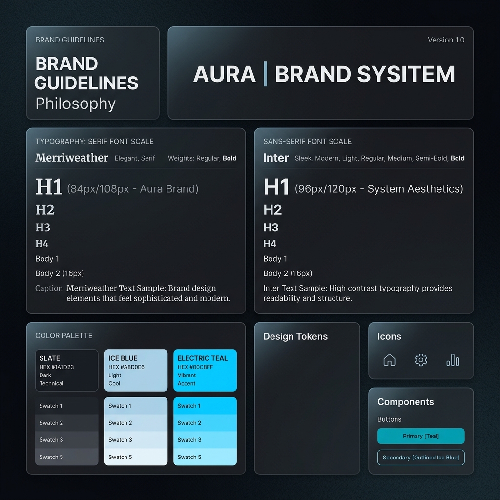
* **Pillar:** Technical precision, velocity, and clarity. * **Palette:** Muted dark slate (dominant), ice blue (structural), electric teal (accent). * **Typography:** Satoshi Variable for headers and body copy. * **Spacing & Corners:** Tight 4px spacing grid, 6px border-radius on UI elements. * **Logo:** Typographic wordmark with a custom ligature in the logo text. * **Design Rationale:** This brand must convey absolute reliability and modern utility. The dark slate background reduces screen glare, while the electric teal accents draw the eye to core conversion points. For deep technical context on how AI is shaping software development workflows, see [Reacit's AI developer tooling audit](https://reacit.com/articles/ai-developer-tooling-2026).
### Scenario 2: The Premium Organic Cosmetics Brand (Tactile Focus)
* **Pillar:** Tactile integrity, natural beauty, and luxury. * **Palette:** Warm alabaster (dominant), soft olive (structural), terracotta (accent). * **Typography:** Instrument Serif for headers, Inter for body copy. * **Spacing & Corners:** Generous 12px spacing grid, soft 16px border-radius. * **Logo:** A clean, organic monogram representing botanical elements. * **Design Rationale:** This identity relies on tactile textures and classic serif typography to signal artisanal craft. The warm alabaster dominant tone avoids the clinical feel of pure white, creating an inviting, luxurious canvas.
### Scenario 3: The Energy Resilience Company (Commodity/Industrial Focus)
* **Pillar:** Durability, energy independence, and security. * **Palette:** Deep forest green (dominant), sand beige (structural), warning amber (accent). * **Typography:** Aeonik Mono for headers, Geist Sans for body. * **Spacing & Corners:** Strict 8px grid, sharp 0px border-radius for a brutalist feel. * **Logo:** A bold, geometric icon resembling solar panel arrays and wind vectors. * **Design Rationale:** Designed to evoke strength and self-reliance in a volatile market. The brutalist, sharp corners and monospace typography signal operational competence and engineering precision. To see how these industrial design principles translate into physical energy market data and reserves analysis, check out [PetroEyes energy intelligence](https://petroeyes.com/news/reserves-to-production-ratio-country-2026/).
---
## Auditing and Evolving Your Identity
A brand identity is not a static document; it is a living system. Conduct a bi-annual visual audit to identify inconsistencies in your implementation and verify that your assets continue to resonate with your audience.
### The "Aesthetic Fatigue" Test
Over time, design trends shift, and what once looked modern can start to feel dated. Pay close attention to "Aesthetic Fatigue" - the point where your target audience begins to tune out your visual assets because they look too similar to competitors.
If you notice a drop in engagement on your social templates or a higher bounce rate on your landing pages, it may be time for a visual refresh. Focus on subtle updates - such as modernizing your typographic scale or introducing procedural textures - rather than a complete rebranding, which can alienate existing customers.
### Retrofitting and maintaining consistency
When updating your identity, document the changes in a centralized brand guideline. Update your design tokens first, ensuring the changes deploy to your live stylesheets. Retrofit existing marketing templates and landing pages to match the new standards, maintaining a unified visual voice across all customer touchpoints.
**What to Read Next:** Once your brand identity is locked down, you must select the typography that will carry your message. Read our expert guide on [Typography Selection for Brands](/asset/typography-selection-brands-2026/) to master visual hierarchy, variable font performance, and dark mode weighting.
Directory Analysis & Suitability
Key Advantages
- Hardware-aware HDR palettes
- Centralized spacing scales
- Accessible contrast rules
Considerations
- Theoretical rather than layout-focused
Platform Compatibility
Web Environment
Exceptional
Mobile & Touch
Exceptional
Desktop Software
Exceptional