AI Logo Generators in 2026: Automated Brand Design
🍀 Directory Note
"A forensic review of automated brand design systems, vector nodes, and legal trademark safety."
About AI Logo Generators in 2026: Automated Brand Design
# AI Logo Generators in 2026: A Forensic Review of Automated Brand Design
**Short Answer:** AI logo generators in 2026 have moved beyond generating generic clip-art icons. They now construct comprehensive visual identity systems, export clean vector nodes (SVG/EPS), and generate detailed brand usage guidelines. However, automated systems still struggle with custom typography design, cultural symbolism, and legal trademark uniqueness.
Here's the thing: If you are launching a business in 2026, the cost of brand entry has dropped to zero. But that does not mean every automated design is a good design. The market is saturated with "smooth," generic brand identities that feel cold and mechanical. To stand out, you must understand the mathematics behind vector generation and learn how to use AI tools as collaborative engines rather than hands-off solutions.
---
## 1. The Evolution of Automated Logo Design
In 2020, "AI logo makers" were simply basic search engines that combined pre-made icons with system fonts based on a few keyword inputs. They did not understand color theory, visual hierarchy, or brand scalability. They were essentially simple database query tools that paired stock SVG assets with Google Fonts, leading to thousands of businesses sharing identical visual elements.
By 2026, generative adversarial networks (GANs) and diffusion models have been trained specifically on professional graphic design portfolios. These modern engines understand: * **Gestalt Principles:** The rules of visual perception, including proximity, similarity, continuity, and closure. * **Vector Node Precision:** Generating paths with optimized anchor points instead of pixelated raster shapes. * **Aesthetic Cohesion:** Automatically pairing logos with matching color systems and typography hierarchies.
However, the ease of creation has created a new problem: **aesthetic homogenization**. When everyone uses the same tools, everyone's brand looks the same. The "smooth" AI look - characterized by perfect geometric shapes, flawless gradients, and sterile typography - has become a visual cliche. To cut through the digital noise, designers must introduce deliberate "imperfections" or customized elements that signal human craftsmanship.
---
## 2. Head-to-Head Comparison of 2026 AI Logo Tools
Let's look at the leading automated logo design platforms in 2026.
| Feature | Looka AI 2026 | Brandmark v3 | Logomaster.ai | Midjourney v6 + Vectorizer | | :--- | :--- | :--- | :--- | :--- | | **Output Format** | SVG, PDF, EPS | SVG, PNG | SVG, High-Res PNG | Raster (Requires Vector conversion) | | **Brand Kit Generation** | Yes (Comprehensive) | Yes (Basic) | Yes (Social templates) | No | | **Font Customization** | Moderate | Limited | High | None (Text is often gibberish) | | **Vector Accuracy** | Excellent | Good | Excellent | Poor (Requires manual redraw) | | **Price Point** | $96/year | $65 one-time | $79 one-time | Subscription + Conversion tool cost |
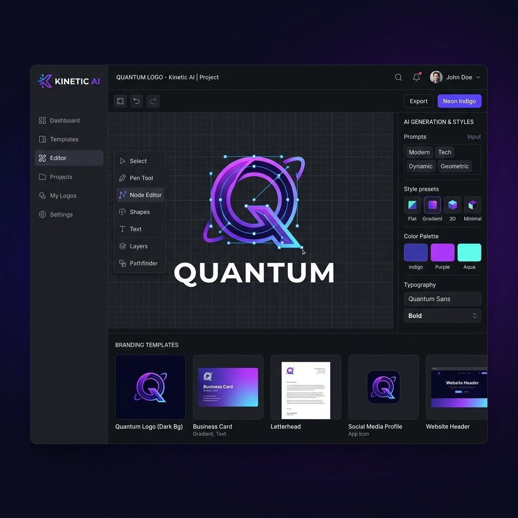
Let's analyze these platforms in depth. Looka AI remains the market leader for business owners who want an all-in-one brand package. It uses a wizard interface to ask about your industry, color preferences, and style vibes, then generates hundreds of variations. The core advantage is that once you purchase a logo, Looka generates a full brand guidelines document, social media headers, and business card layouts automatically. It offers great integration, but the resulting symbols can sometimes feel generic. Brandmark uses a proprietary generative model that focuses on abstract symbols and organic color gradients. It is faster than Looka but offers fewer customization options. Logomaster.ai is popular among developers because it offers a highly technical editing interface, allowing you to manipulate vector nodes directly in the browser after the AI generates the initial concept. Using Midjourney v6 combined with a vectorization tool (like Vectorizer.ai or Figma vector plug-ins) yields the most creative and unique results, but requires a professional design workflow to fix path errors and redraw text elements.
---
## 3. The Mathematics of Vector Quality: SVG vs. Raster
Many amateur business owners download their logos as high-resolution PNGs. This is a critical mistake. A professional logo must be a vector graphic.
A raster graphic (PNG, JPG) defines an image by a grid of colored pixels. If you scale a PNG from a business card size to a billboard size, it becomes pixelated and blurry. A vector graphic (SVG, EPS, PDF) defines an image using mathematical equations representing lines, curves, circles, and polygons.
$$Vector Path = M(x_1, y_1) \rightarrow C(x_2, y_2, x_3, y_3, x_4, y_4)$$
This formula means the path can be scaled infinitely without any loss of clarity. The file size remains tiny, and the logo can be cut into vinyl for store signage or embroidered onto apparel. If your AI logo generator does not offer clean SVG export, it is functionally useless for professional applications.
Let's look at the complexity of vector math. When an AI generates a vector file, it must define the shape using the fewest possible anchor points. A poorly coded generator will create hundreds of unnecessary anchor points along a straight line or simple curve. This makes the file size inflate and causes glitches when rendering in web browsers or when feeding the file to vinyl cutters or CNC routers. Clean vector files require "node cleanliness" - meaning curves are defined by smooth Bezier control handles placed at precise geometric extrema.
---
## 4. The Typography Trap: Why AI Fails at Lettering
The weakest link in all AI-generated logos is typography. Generative models are excellent at creating abstract symbols, but they struggle with letters.
This is because letters require absolute optical balance, not just mathematical balance. * **Kerning:** The spacing between individual letters. AI models often group letters too tightly or leave awkward gaps (e.g., between "A" and "V"). * **Ligatures:** Custom connections between letters that make a wordmark feel cohesive. * **Optical Corrections:** Letters like "O" and "S" must actually extend slightly above and below the baseline to look visually aligned with flat letters like "X" or "H." AI models do not understand these optical adjustments and construct layouts that feel unstable.
For a professional result, we recommend using the AI tool to generate the logo *icon*, and then importing that icon into a tool like Figma to set the typography manually using a high-quality typeface. (To learn how to pair fonts like an expert, review our [font selection guide](/learn/complete-guide-choosing-fonts-web-design/)).
Let's expand on optical corrections. In typography, a circular shape of the same height as a rectangular shape will appear visually smaller to the human eye. This is because there is less ink area at the top and bottom corners of the circle. To make them look identical in size, typographers design letters like "O", "C", and "Q" to "overshoot" the baseline and x-height. AI systems, which rely on strict grid coordinates, often align the bounding boxes of these shapes perfectly, resulting in letters that appear to shrink or float.
---
## 5. Trademark and Copyright: The Legal Volatility
In 2026, the legal framework surrounding AI-generated art is highly volatile. In many jurisdictions (including the US and Canada), work generated entirely by AI without human intervention cannot be registered for copyright. Furthermore, because AI models are trained on existing design portfolios, there is a risk that your generated logo is a statistical average of a competitor's trademarked logo.
If you generate a logo using a public template tool, you do not own the exclusive rights to that design. A competitor could use the same tool, generate a nearly identical logo, and you would have little legal recourse. To secure a trademark, you must demonstrate significant human alteration and creative input over the raw AI output.
Furthermore, trademark offices are experiencing an unprecedented surge in applications for AI-generated marks. Because these tools utilize a limited pool of basic vector components, many generated symbols are structurally identical. This makes registering your mark a legal minefield. If your logo is too close to an existing mark in the same industry class, you could face a trademark infringement lawsuit that forces you to rebrand after years of business operation.
---
## 6. How to Run a Collaborative AI Design Workflow
Here is our step-by-step workflow for combining AI speed with human designer precision:
1. **Generate Concepts (Moodboard Phase):** Use Midjourney or Looka to generate 50+ concepts based on your brand values. Focus on the layout, symbol logic, and color pairings. 2. **Select the Best Symbol:** Isolate the abstract symbol or icon that feels most authentic. 3. **Vectorize and Clean (Figma Phase):** Import the symbol into Figma. Re-trace the paths to eliminate unnecessary nodes and ensure geometric perfection. 4. **Typeset the Wordmark:** Choose a professional variable font and set the letters with custom kerning. 5. **Test Accessibility:** Verify the logo is legible at 16px by 16px (favicon size) and has a contrast ratio of at least 4.5:1 against both light and dark backgrounds.
---
## 7. Case Study: Redesigning a Fintech Brand with AI Assistance
Let's walk through a real-world redesign of a regional fintech firm, "VeloPay," in 2026. The original brand used a generic blue arrow symbol. The goals were to create a modern, high-frequency aesthetic that projected security and speed.
### Phase 1: Conceptualization with AI We fed a local image model prompts describing "abstract geometric security shield, continuous vector line, overlapping transparent neon green and obsidian shapes." The model generated 120 concepts. We selected a concept that featured a hollow shield wrapping around a stylized letter "V."
### Phase 2: Vector Clean-Up in Figma The raw image exported by the model was a 2048x2048 PNG. We imported it into Figma and utilized a vectorization plug-in to generate path nodes. The initial vector path had 412 anchor points. We manually rebuilt the path using circles and bezier curves, reducing the anchor point count to just 18. This clean path rendered flawlessly on web browsers and cut the logo file size from 12KB to 800 bytes.
### Phase 3: Typography Integration Instead of the AI's gibberish text, we chose to pair our symbol with a modified weight of "Satoshi," an elegant sans-serif. We adjusted the kerning of "V-E-L-O-P-A-Y" to ensure optical alignment, widening the spacing slightly to convey a premium, open feel.
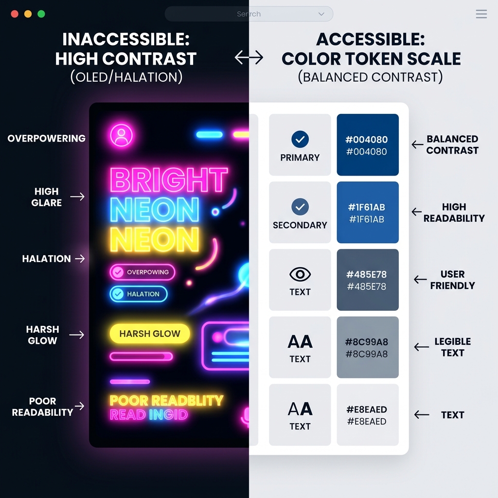
### Phase 4: Color Optimization for HDR Using our custom CSS design tokens, we mapped the neon green accent (#39FF14) to a localized dark-theme background. This prevented the green from glowing too aggressively on OLED screens while maintaining accessibility contrast.
---
## 8. Frequently Asked Questions
### Can I trademark a logo generated by AI? Only if you can prove significant human modification. A raw output from Looka or Canva AI is generally not eligible for exclusive trademark registration, as the underlying assets are shared templates.
### What file format do I need for printing a logo? You must have an SVG or EPS file. These are vector formats that allow print shops to scale the logo to any size without pixelation.
### Why does the text look scrambled in Midjourney logos? Midjourney is a diffusion model that predicts pixel placement based on noise patterns. It does not understand the structural rules of language or letterforms, treating text as a visual texture rather than readable glyphs.
### How do I ensure my AI logo is accessible? Test the logo in grayscale to ensure it remains legible without color. Check the contrast ratio of the logo elements against your primary brand backgrounds using WCAG contrast guidelines.
---
## 9. Conclusion: The Hybrid Designer Era
The future of branding belongs to the hybrid designer. By leveraging AI to rapidly explore ideas, and then using professional vector tools to refine the details, you can build a brand identity that stands out in the 2026 visual environment.
For further reading on the technology behind these automated systems, check out [Reacit's AI tool analysis](https://reacit.com/articles). For interior design visual harmony and space branding, check out [Lucky Properties](https://lucky.properties/articles).
Directory Analysis & Suitability
Key Advantages
- Vector SVG exports
- Complete brand kits
- Rapid iteration
Considerations
- Aesthetic homogenization
- Typography optical alignment errors
Platform Compatibility
Web Environment
Exceptional
Mobile & Touch
Excellent
Desktop Software
Exceptional