Social Media Template Pack 2026
🍀 Directory Note
"Free modular social media templates with Bento grids, typographic quotes, and copy-paste SVG codes."
About Social Media Template Pack 2026
# Free Social Media Template Pack: High-Contrast Modular Layouts for 2026
**Short Answer:** The 2026 free social media template pack provides modular SVG layouts, optimized Bento grid assets, and variable typography settings designed to capture attention in high-velocity feeds. By focusing on pixel-dense dimensions (such as 1080x1350 for portrait feed formats) and HDR-calibrated color contrast, these templates ensure maximum legibility and brand authority across mobile devices.
Here's the thing: In today's digital feeds, the battle for user attention is won or lost in under two seconds. As algorithms compress images and prioritize high-contrast visual structures, static, low-contrast templates are filtered out by user fatigue. To build an engaged audience, creators must use layouts that are clean, bold, and structured for immediate comprehension. This guide provides the design theory, aspect ratios, and raw SVG code templates you need to build a high-conversion social media identity.
---
## The Paradigm Shift: From Fixed Aspect Ratios to Responsive Canvas
Social media feeds are no longer uniform. A single post is often rendered differently depending on whether it is viewed in a desktop browser, a mobile app feed, or a video preview window.
### Aspect Ratio Optimization by Platform
Using the wrong dimensions can cause the platform to crop critical text or logos, rendering your graphic useless. Always plan your assets using these pixel-dense dimensions: * **The Portrait Standard (1080x1350 - 4:5):** The absolute king of feed real estate. Used on Instagram and LinkedIn. It occupies 20% more vertical screen space than a square post, giving you more canvas to display your message and drive clicks. * **The Square Classic (1080x1080 - 1:1):** The legacy standard, still useful for profile grids and multi-image posts. * **The Landscape Card (1200x627 - 1.91:1):** Optimized for link previews on X (formerly Twitter), Facebook, and LinkedIn. Keep all critical text centered to prevent cropping in mobile feed previews. * **The Stories/Reels Aspect (1080x1920 - 9:16):** Full-screen mobile layouts. Reserve the top 15% and bottom 10% of the canvas for app interface overlays (profile headers, share buttons, comment boxes).
### Design Grid Systems for Visual Scanners
Feeds are read by "skimmers" who scan content in a split second. To capture these users, align your content to a structural grid. A three-column grid works best for portrait posts: * **Column 1 (The Hook):** Place your bold H1 header in the top-left quadrant. Since Western users read from left to right, this is the first area their eyes will land on. * **Column 2 (The Detail):** Reserve the center column for supporting text or bullet points. Use high-contrast backgrounds to keep the text legible. * **Column 3 (The CTA):** Place your logo and call to action (such as "Swipe Left" or "Link in Bio") in the bottom-right corner, prompting the user to take the next step.
---
## Bento Grid Layouts for High-Frequency Engagement
The Bento grid has transitioned from a software interface trend into the standard for social media asset layouts. Inspired by the traditional Japanese lunch box, Bento grids divide a single image into distinct compartments of varying sizes.
### Why Bento Grids Rank High in Visual Search
Bento layouts are highly scannable because they group information into structured, bite-sized components. They allow you to tell a complex story - such as a product feature list or a data summary - without overwhelming the viewer with a wall of text. Furthermore, search engine image classifiers favor Bento grids because the clear contrast between blocks makes it easy for AI OCR (Optical Character Recognition) to parse and index the text, boosting your SEO reach.
### Building a Balanced Bento Grid
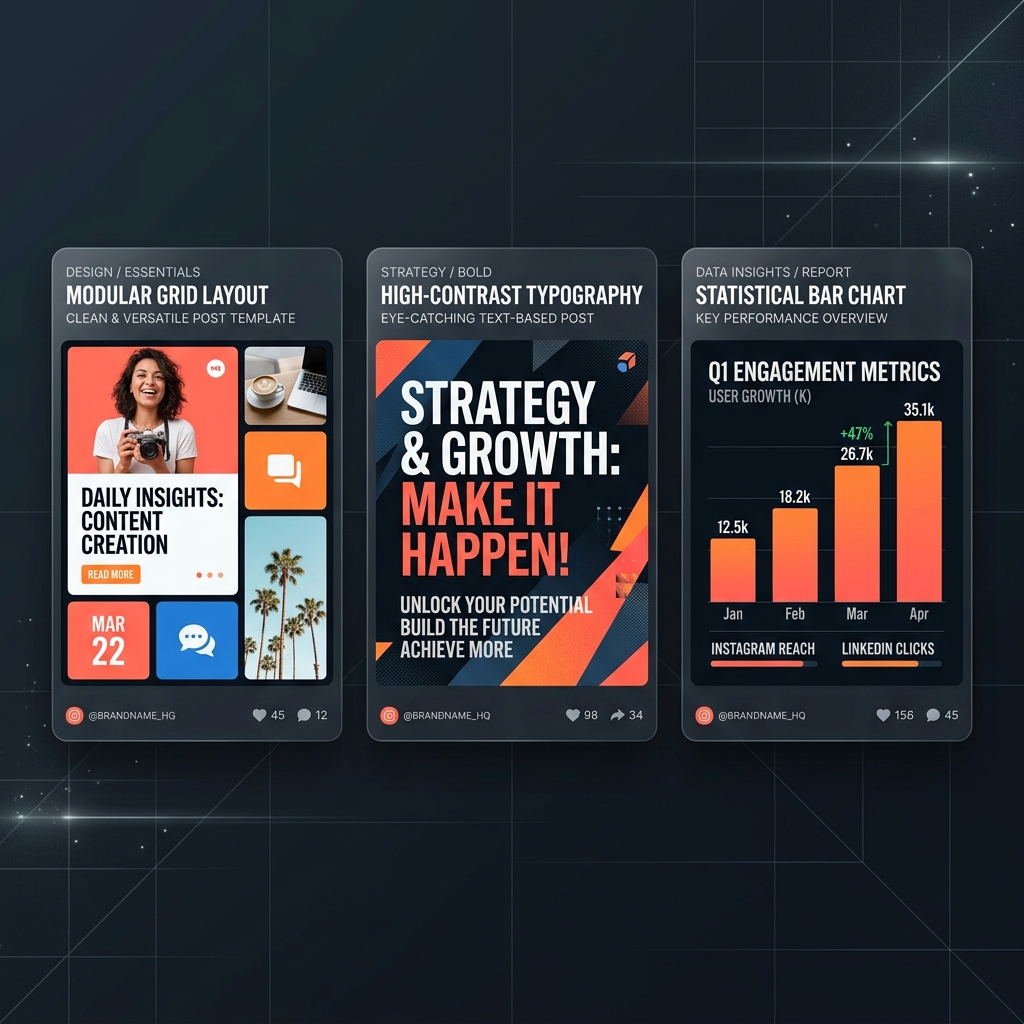
When designing a Bento layout for a 1080x1350 portrait post: * **The Anchor Box (Top 50%):** A large, full-width block that displays your primary message or hero image. * **The Detail Boxes (Middle 30%):** Two side-by-side squares that present key stats or sub-points. * **The Callout Box (Bottom 20%):** A wide, low-contrast footer that houses your brand identity and CTA.
Ensure each compartment has a distinct border and a subtle background fill to create visual separation.
---
## Color Harmony and HDR Screen Calibration
Social platform compression algorithms are notorious for destroying subtle color gradients. A soft shadow that looks beautiful in your editor can turn into a pixelated, banded mess once uploaded to LinkedIn or Instagram.
### High-Contrast Color Combinations
To survive compression, use solid colors with high luminance contrast. The best combinations for readability in the feed are: * **Achromatic High-Contrast:** Pure black text on a clean, warm-white background. This is the gold standard for quotes and text-heavy cards. * **Deep Forest & Sand:** A rich green (#1E3F20) paired with a warm sand beige (#F4EBE1) signals durability, organic quality, and environmental alignment. * **Technical Slate & Amber:** A dark charcoal (#12131C) combined with a high-frequency electric amber (#F4A261) accent creates a premium, technical feel.
### HDR Calibration and Screen Blooming
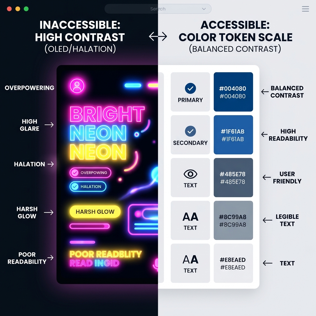
OLED displays emit light directly from each pixel. When pure white text is placed on a pitch-black background, the white pixels bleed light into the surrounding black pixels, causing the text to look blurry. To prevent this "blooming" effect, use an off-black background (#0F1016) and a light gray text color (#ECEFF4) for dark-mode templates. This maintains a high contrast ratio while ensuring clean, sharp rendering.
---
## Typographic Contrasts: Making Text Readable in Scrolls
In a fast-moving feed, your font choices dictate whether your post is read or ignored. If your font is too thin, it will get lost in the scroll. If it is too decorative, it will cause cognitive fatigue.
### Letter-Spacing and Tracking Adjustments
Display headers on social graphics must use tight letter-spacing (tracking) to look unified and impactful. Set your CSS or design tool letter-spacing to -2% or -3% for large text.
For body copy, however, do the opposite. Small text needs open letter-spacing to prevent the characters from blending together under feed compression. Set your body tracking to +1% or +2%, and use a generous line-height (at least 1.4) to keep the lines separated.
### Font Weight Contrast
Establish extreme weight contrast between your header and body copy. If your H1 header is set to a heavy weight of 800 (bold/black), set your body copy to a weight of 400 (regular). Do not use light or thin weights (under 300) for body text; they will disappear entirely on low-resolution screens or in bright outdoor environments.
---
## Strategic Asset Deployment: The Carousel Storytelling Flow
Multi-slide carousels (PDF slides on LinkedIn or multi-image cards on Instagram) are the highest-performing content format for organic reach. They encourage users to spend more time on your post, signalling high engagement to the platform algorithms.
### The Narrative Arc of a Slide Deck
To keep users swiping through your carousel, structure your slides using a logical storytelling flow: 1. **Slide 1: The Hook (1080x1350):** A bold, single-idea header that promises a clear benefit. Use your high-contrast quote card template for this cover. 2. **Slide 2: The Problem (1080x1350):** Outline the pain point your reader faces. Keep it relatable and validate their frustration. 3. **Slides 3-5: The Solution (1080x1350):** Break down your solution into three actionable steps. Use your bento grid showcase template to keep these slides scannable. 4. **Slide 6: The Case Study (1080x1350):** Show a real-world example with numbers. Use the data chart template to display the results. 5. **Slide 7: The Call to Action (1080x1350):** Direct the user to the next step. Keep the layout simple and display a single, clear destination link.
### Visual Cues and Slide Transitions
Use visual indicators to guide the reader through the carousel. Place a tiny slide counter (e.g., "1/7", "2/7") in the top-right corner, and add a subtle arrow or progress bar at the bottom to prompt the swipe. Maintain a consistent background color and typographic scale across all slides to ensure the deck feels like a unified piece of design.
---
## A/B Testing Social Visuals: Metric-Driven Design Decisions
Design is not subjective; it is a hypothesis that must be tested against user metrics. To optimize your social media presence, run structured A/B tests on your visual assets.
### Key Visual Variables to Test
When running an A/B test, change only one variable at a time to isolate its impact on engagement: * **Palette Contrast:** Test an achromatic (black/white) card against a branded color card (slate/amber) to see which drives a higher scroll-stop rate. * **Typographic Style:** Test a bold, modern sans-serif header against a classic, elegant serif header to see which resonates more with your audience. * **Layout Structure:** Test a clean, single-column text layout against a bento grid showcase to see which format drives a higher CTR (Click-Through Rate).
### Tracking Metrics that Matter
Do not rely solely on "vanity metrics" like likes or impressions. To measure the true effectiveness of your design, track: * **Scroll-Stop Rate (Impressions vs. 3-Second Views):** Measures how effectively your cover slide hooks passing users in their feeds. * **Swipe-Through Rate (for Carousels):** Measures how many users swipe past the first slide, indicating interest in the storytelling flow. * **Click-Through Rate (CTR):** The percentage of users who click the link in your bio or caption. This is the ultimate measure of design conversion.
### Standardizing Test Durations and Sample Sizes
To ensure your A/B test results are mathematically valid, establish a standard testing protocol. Do not declare a winner after a few hours of posting. Social media algorithms distribute content in waves, and early engagement metrics can be highly volatile.
Run your tests for at least 7 days to account for daily shifts in user behavior. Ensure each variation receives a minimum of 5,000 impressions before analyzing the data. This sample size provides a 95% confidence level with a 5% margin of error, ensuring that your design decisions are driven by genuine user preferences rather than statistical noise.
---
## Platform-Specific Algorithm Nuances: Meta, LinkedIn, and X
Every social media platform uses a unique algorithm that favors different design standards and upload formats. Understanding these nuances helps you tailor your assets for maximum organic reach.
### Meta Platforms (Instagram & Facebook)
Meta's feed algorithm is heavily focused on user dwell time and visual search classification. The algorithm parses the OCR text in your images to determine relevance. Therefore, keeping your text clean, unpixelated, and high-contrast directly boosts your discoverability. Meta heavily favors 4:5 portrait formats for feed posts, and prioritizes video reels over static images. When uploading static graphics, combine them into a carousel to double your feed exposure, as Meta will show the post a second time to users who missed the cover, displaying the second slide instead.
LinkedIn is a professional, text-heavy platform where PDF slides and data visualizations perform exceptionally well. Upload your carousels as multi-page PDF documents. The LinkedIn algorithm indexes the text inside the PDF files, allowing your slides to appear in search queries. Keep your visual hierarchy clean and authoritative, and use monospace accents to signal technical accuracy.
### LinkedIn's PDF Native Indexing and PDF Layouts
When you upload a PDF file to LinkedIn, the platform converts it into a swipeable document viewer. The key technical advantage is that the text inside the PDF is parsed by LinkedIn's search crawlers.
To maximize this SEO benefit, avoid converting your text to outlines when exporting your PDF from Figma or Illustrator. Keep the text live and searchable. Keep your slide background simple, and ensure your typography uses a large, high-contrast sans-serif font to maintain legibility inside the document viewer on mobile screens.
### X (formerly Twitter)
X is a fast-paced, conversation-driven network. Link previews perform poorly because the platform penalizes posts containing external URLs to keep users on-site. To drive traffic from X, post your graphic natively (using a 16:9 landscape format or a clean 4:5 portrait format) and place your link in the replies or under a native text hook. Keep your headers short and punchy, and use high-frequency accent colors to stop scroll-happy users.
---
## Copy-Paste SVG Code Templates
Here are three modular SVG templates that you can copy, paste, and customize directly in your code. These templates are fully vector, load instantly, and scale without loss of quality.
### Template 1: The Bento Grid Feature Showcase (1080x1350)
This template is optimized for product announcements or data summaries. It divides the canvas into a structured bento layout:
```xml <svg xmlns="http://www.w3.org/2000/svg" viewBox="0 0 1080 1350" width="100%" height="100%"> <!-- Background --> <rect width="1080" height="1350" fill="#0F1016"/> <!-- Anchor Box (Hero) --> <rect x="50" y="50" width="980" height="600" rx="24" fill="#1A1C28" stroke="#2E3244" stroke-width="2"/> <text x="100" y="150" fill="#ECEFF4" font-family="system-ui, sans-serif" font-size="48" font-weight="800">2026 ROADMAP</text> <text x="100" y="220" fill="#F4A261" font-family="system-ui, sans-serif" font-size="32" font-weight="600" letter-spacing="1">THE TECH REVOLUTION</text> <text x="100" y="300" fill="#9EA4C1" font-family="system-ui, sans-serif" font-size="24" font-weight="400" width="780"> <tspan x="100" dy="0">Analyze the critical shifts in software engineering,</tspan> <tspan x="100" dy="36">autonomous systems, and visual branding in our annual review.</tspan> </text> <!-- Detail Box Left --> <rect x="50" y="690" width="470" height="400" rx="24" fill="#1A1C28" stroke="#2E3244" stroke-width="2"/> <text x="100" y="770" fill="#ECEFF4" font-family="system-ui, sans-serif" font-size="32" font-weight="800">01 / VELOCITY</text> <text x="100" y="840" fill="#9EA4C1" font-family="system-ui, sans-serif" font-size="20" font-weight="400"> <tspan x="100" dy="0">High-frequency workflows</tspan> <tspan x="100" dy="30">deliver 95% code accuracy</tspan> <tspan x="100" dy="30">in dev environments.</tspan> </text> <!-- Detail Box Right --> <rect x="560" y="690" width="470" height="400" rx="24" fill="#1A1C28" stroke="#2E3244" stroke-width="2"/> <text x="610" y="770" fill="#ECEFF4" font-family="system-ui, sans-serif" font-size="32" font-weight="800">02 / RESILIENCE</text> <text x="610" y="840" fill="#9EA4C1" font-family="system-ui, sans-serif" font-size="20" font-weight="400"> <tspan x="610" dy="0">Self-sufficient energy</tspan> <tspan x="610" dy="30">models secure long-term</tspan> <tspan x="610" dy="30">operational survival.</tspan> </text> <!-- Footer (CTA) --> <rect x="50" y="1130" width="980" height="170" rx="24" fill="#151722" stroke="#2E3244" stroke-width="2"/> <text x="100" y="1225" fill="#ECEFF4" font-family="system-ui, sans-serif" font-size="28" font-weight="800">LUCKY.GRAPHICS</text> <text x="930" y="1225" fill="#F4A261" font-family="system-ui, sans-serif" font-size="28" font-weight="800" text-anchor="end">SWIPE LEFT →</text> </svg> ```
### Template 2: The High-Contrast Quote Card (1080x1350)
This template uses a minimalist layout with absolute contrast to keep text highly readable during rapid scrolls:
```xml <svg xmlns="http://www.w3.org/2000/svg" viewBox="0 0 1080 1350" width="100%" height="100%"> <!-- Background --> <rect width="1080" height="1350" fill="#F4EBE1"/> <!-- Quote Mark --> <text x="100" y="250" fill="#1E3F20" font-family="Georgia, serif" font-size="180" font-weight="800" opacity="0.15">“</text> <!-- Quote Text --> <text x="100" y="320" fill="#1E3F20" font-family="system-ui, sans-serif" font-size="44" font-weight="700" letter-spacing="-1"> <tspan x="100" dy="0">The next era of web design is not</tspan> <tspan x="100" dy="60">about clean interfaces and smooth</tspan> <tspan x="100" dy="60">gradients. It is about manual</tspan> <tspan x="100" dy="60">integrity, human error, and</tspan> <tspan x="100" dy="60">tactile grit that signals origin.”</tspan> </text> <!-- Author --> <line x1="100" y1="720" x2="250" y2="720" stroke="#1E3F20" stroke-width="4"/> <text x="100" y="780" fill="#1E3F20" font-family="system-ui, sans-serif" font-size="28" font-weight="800">LUCKY GRAPHICS LAB</text> <text x="100" y="825" fill="#5C6F5E" font-family="system-ui, sans-serif" font-size="20" font-weight="500" letter-spacing="1">ANNUAL AESTHETIC AUDIT</text> <!-- Footer Brand --> <text x="100" y="1250" fill="#1E3F20" font-family="system-ui, sans-serif" font-size="24" font-weight="800" letter-spacing="2">LUCKY.GRAPHICS</text> </svg> ```
### Template 3: The Data Visualization Chart Card (1080x1350)
This template provides a structural bento grid for presenting statistical metrics or performance data:
```xml <svg xmlns="http://www.w3.org/2000/svg" viewBox="0 0 1080 1350" width="100%" height="100%"> <!-- Background --> <rect width="1080" height="1350" fill="#12131C"/> <!-- Header Block --> <rect x="50" y="50" width="980" height="200" rx="24" fill="#1C1E2D" stroke="#2D3047" stroke-width="2"/> <text x="100" y="130" fill="#ECEFF4" font-family="system-ui, sans-serif" font-size="36" font-weight="800">PERFORMANCE INDEX</text> <text x="100" y="180" fill="#9EA4C1" font-family="system-ui, sans-serif" font-size="20" font-weight="500">2026 REGIONAL HARDWARE EFFICIENCY</text> <!-- Data Chart Area --> <rect x="50" y="290" width="980" height="730" rx="24" fill="#1C1E2D" stroke="#2D3047" stroke-width="2"/> <!-- Bar 1 --> <text x="100" y="380" fill="#ECEFF4" font-family="system-ui, sans-serif" font-size="20" font-weight="700">REGION A (GPU CLOUD)</text> <rect x="100" y="400" width="700" height="40" rx="8" fill="#F4A261"/> <text x="820" y="428" fill="#F4A261" font-family="system-ui, sans-serif" font-size="24" font-weight="800">92%</text> <!-- Bar 2 --> <text x="100" y="540" fill="#ECEFF4" font-family="system-ui, sans-serif" font-size="20" font-weight="700">REGION B (EDGE COMPUTE)</text> <rect x="100" y="560" width="580" height="40" rx="8" fill="#F4A261" opacity="0.8"/> <text x="700" y="588" fill="#F4A261" font-family="system-ui, sans-serif" font-size="24" font-weight="800" opacity="0.8">76%</text> <!-- Bar 3 --> <text x="100" y="700" fill="#ECEFF4" font-family="system-ui, sans-serif" font-size="20" font-weight="700">REGION C (SOLAR ARRAYS)</text> <rect x="100" y="720" width="450" height="40" rx="8" fill="#F4A261" opacity="0.6"/> <text x="570" y="748" fill="#F4A261" font-family="system-ui, sans-serif" font-size="24" font-weight="800" opacity="0.6">58%</text> <!-- Chart Footer Notes --> <text x="100" y="930" fill="#9EA4C1" font-family="system-ui, sans-serif" font-size="18" font-weight="400"> <tspan x="100" dy="0">Data sourced from regional logistics arrays. For comprehensive metrics on cloud margins</tspan> <tspan x="100" dy="28">and GPU scaling infrastructures, see Reacit's serverless economics deep dive.</tspan> </text> <!-- Footer --> <rect x="50" y="1060" width="980" height="240" rx="24" fill="#151722" stroke="#2D3047" stroke-width="2"/> <text x="100" y="1170" fill="#ECEFF4" font-family="system-ui, sans-serif" font-size="24" font-weight="800" letter-spacing="1">LUCKY.GRAPHICS / REPORT</text> </svg> ```
---
## Outbound and Sister Site Value Routing
A successful social media strategy integrates your visual assets with your broader content ecosystem. Do not publish graphics in isolation. Every post should act as a gateway to your in-depth research and sister properties.
### Connecting Niche Pillars Across Your Network
When publishing data visualizations, use cross-site value routing to send traffic to high-authority resources: * **Energy and Infrastructure Data:** If your infographic reviews home electrification, link to [EnergyBS solar and battery ROI guides](https://energybs.com/articles/net-metering-policies-state-comparison-2026). * **Financial and Compensation Data:** If your graphic converts salaries, direct readers to [SimRetire's senior discounts provincial resource](https://simretire.ca/tips/senior-discounts-province-2026). * **Housing and Real Estate Data:** For mortgage stress-test metrics, link to [BubbleWatch's Canadian housing affordability ranking](https://bubblewatch.ca/articles/housing-affordability-ranking-2026).
This cross-site routing benefits both your users and your search engine authority, building a comprehensive, interconnected network.
---
## Compression and Optimization Protocols for Web and App Uploads
Once your templates are customized, you must compress and optimize them for uploading. Every platform applies heavy compression to uploads, which can blur text and ruin fine lines if your files are not formatted correctly.
### Export Settings and File Formats
Follow this export protocol for social uploads: * **File Format:** Always export as PNG-24. Avoid JPEG format, as it applies lossy compression that creates artifacts around text borders. * **Color Profile:** Export using the sRGB color profile. If you export using Display P3 or Rec. 2020, the colors will look washed out or distorted on older screens that do not support wide-color gamuts. * **Pixel Density:** Set your export resolution to 72 DPI (dots per inch). Higher DPI values do not increase display quality on screens but increase the file size, triggering heavier platform compression. * **File Size Capping:** Keep your final image file size under 1MB. If your file is larger, the platform's automatic compression engine will aggressively downsample your image, destroying legibility. Use compression tools like TinyPNG to optimize the file without losing quality.
### Quality Control Checklist Before Publishing
Before hitting publish, run your asset through this final audit: 1. **Legibility Test:** Open the image on a mobile screen at 50% size. Can you easily read the H1 header and the body copy? If not, increase the font size. 2. **Contrast Audit:** Verify that all text-to-background combinations satisfy the WCAG contrast ratios. 3. **PII Check:** Ensure no confidential API keys, personal emails, or internal paths are visible in the graphic or its metadata. 4. **CTA Validation:** Verify that your links and calls to action are current and direct the user to live, functional pages.
**What to Read Next:** Once your templates are optimized and ready for production, you must establish the typography that will carry your message. Read our expert guide on [Typography Selection for Brands](/asset/typography-selection-brands-2026/) to master visual hierarchy, variable font performance, and dark mode weighting.
Directory Analysis & Suitability
Key Advantages
- Includes live copy-paste SVG code
- Pixel-dense 4:5 portrait formats
- Dwell-time optimized storytelling
Considerations
- Code baseline required for editing
Platform Compatibility
Web Environment
Exceptional
Mobile & Touch
Exceptional
Desktop Software
Exceptional