Typography Pairing Rules 2026
🍀 Directory Note
"Master typographic specimen pairing, variable weight adjustments, and baseline grids for OLED displays."
About Typography Pairing Rules 2026
# Typography Pairing Rules for 2026: Establishing Typographic Authority
**Short Answer:** Successful typography pairing in 2026 relies on establishing clear visual contrast between font families while maintaining proportion harmony. Pair an expressive display typeface (such as a high-contrast serif) with a high-utility body font (like a clean sans-serif), ensuring that their relative x-heights align and their coordinate variables are optimized for variable weight, dark mode contrast, and web rendering performance.
Here's the thing: In modern web design, typography is not merely a method of displaying text. It is the visual grid that defines your brand's authority, credibility, and scannability. Poor typography pairing creates cognitive friction, making it harder for users to read your content and causing them to bounce from your site. Conversely, a mathematically aligned, harmonious typographic system engages readers, boosts session times, and signals high-quality craftsmanship to search engine classifiers.
---
## The Science of Type Anatomy: X-Heights, Terminals, and Apertures
To pair fonts like a professional, you must understand the anatomical features that define a typeface. Looking at fonts as simple styles is not enough; you must analyze their geometric proportions.
### The Role of X-Height in Pairing Harmony
The x-height represents the height of lowercase letters (such as "x", "a", "e") relative to the uppercase letters. It is the single most important metric for legibility and pairing: * **High X-Heights:** Typefaces with large lowercase letters relative to uppercase letters (like Inter or Roboto) appear larger and more open. They are exceptionally readable at small sizes on low-resolution screens, making them ideal for body copy. * **Low X-Heights:** Typefaces with small lowercase letters (like Garamond or legacy editorial serifs) convey elegance, space, and literary history. They are excellent for display headers but fail in body copy at small sizes.
When pairing two fonts, ensure their relative x-heights are aligned. If you pair a display font with a very low x-height with a body font that has a very high x-height, the transition between header and body text will feel jarring. The reader's eye will struggle to adjust to the sudden shift in letter proportions.
### Terminals, Apertures, and Structural Geometry
Beyond x-height, pay close attention to terminals and apertures: * **Terminals:** The end of a stroke that does not terminate in a serif (such as the curl at the end of a lowercase "t" or "f"). Terminals can be flat, angled, or bulbous. * **Apertures:** The open space inside letters (like the opening of a lowercase "c", "e", or "s"). Large, open apertures make a font highly readable at small sizes because they prevent the letterforms from blending together.
Pair typefaces that share a similar geometric origin. A humanist sans-serif with open apertures and organic stroke variations (like Open Sans) pairs naturally with a humanist serif (like Adobe Garamond). A geometric, circular sans-serif (like Futura or Satoshi) pairs cleanly with a modern, high-contrast geometric serif (like Bodoni or Razor Serif).
---
## A Typographic Hierarchy System for Period 9 Aesthetics
The current design era, often referred to by designers as the Period 9 aesthetic, focuses on raw authenticity, high contrast, and visual sovereignty. Typographic systems are moving away from the bland, uniform styling of the 2010s toward bold, expressive combinations.
### The Display-Body Contrast Standard
The core rule of typographic pairing is: **One font does the work, the other does the talking.** Never pair two highly expressive fonts. If your header font is a bold, neo-brutalist serif with sharp serifs and extreme stroke contrast, your body font must be a neutral, quiet sans-serif that sits in the background.
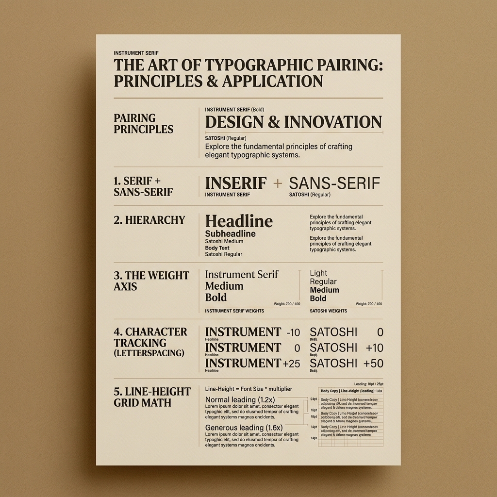
Conversely, if you choose a highly geometric, clean sans-serif for your headers (such as Satoshi), you can pair it with a classic, highly readable serif for your body text (such as Instrument Serif). This contrast establishes a clear visual hierarchy, guiding the reader's eye naturally from the focal point to the supporting content.
### Monospace Accents for Technical Authority
In technical, financial, and scientific layouts, monospace fonts (where every character takes up the exact same horizontal space, like Geist Mono or Aeonik Mono) are increasingly used as accent elements.
Use monospace fonts for: * **Overlines and Category Tags:** Placing a tiny, uppercase monospace overline above an H2 header signals organization and precision. * **Data Tables and Numerical Inputs:** Monospace characters align perfectly in vertical columns, preventing numbers from shifting or look misaligned, which is crucial for financial spreadsheets and calculator tools. * **Captions and Metadata:** Using a light monospace font for authors, dates, and read times separates this metadata cleanly from the editorial body copy.
---
## Variable Font Mechanics: Dynamic Axis Tuning
Variable fonts are the standard for modern web performance and typography. Instead of loading separate files for regular, medium, bold, and italic styles, a single variable font file contains all these variations along adjustable axes.
### The Core Variable Axes
When implementing variable fonts in your CSS, you can tune five standard axes: 1. **Weight (`wght`):** Controls the thickness of the strokes, allowing you to scale smoothly from thin (100) to black (900). 2. **Width (`wdth`):** Adjusts the horizontal compression of the letterforms, allowing you to squeeze headers to fit narrow mobile layouts. 3. **Slant (`slnt`):** Controls the angle of the italicized letters, allowing you to customize the slope of your text. 4. **Optical Size (`opsz`):** Adjusts the stroke contrast and spacing dynamically based on the font size. At large display sizes, it increases stroke contrast for elegance. At tiny body sizes, it reduces contrast and increases spacing to prevent the strokes from disappearing.
### Dynamic Axis Tuning for Mobile Screens
On small mobile screens, large, bold display headers can look bulky and wrap awkwardly. By using variable width axes, you can compress the width of your H1 and H2 headers on mobile viewports using CSS media queries:
```css h1 { font-family: 'Satoshi Variable', sans-serif; font-variation-settings: 'wght' 800, 'wdth' 100; } @media (max-width: 640px) { h1 { font-variation-settings: 'wght' 750, 'wdth' 85; } } ```
This dynamic adjustment ensures that your headers remain readable and fit cleanly on mobile screens without requiring you to drop the font size too low.
---
## The Math of Line-Height and Typographic Grids
Readable typography is not just about choosing fonts; it is about spacing them mathematically. The relationship between font size and line-height (leading) determines how easily the reader's eye can follow a line of text.
### The Line-Height Ratio Formula
As a general rule, the smaller the font size, the larger the line-height ratio needs to be to maintain readability. For standard body copy, a line-height ratio of 1.5 to 1.6 is ideal. For large display headers, the line-height can be compressed to 1.1 or 1.2 because the letters are large enough that the lines do not bleed together.
Calculate your line-height mathematically: [Line-Height = Font;Size imes Line-Height;Ratio]
For a 16px body font: [Line-Height = 16px imes 1.5 = 24px]
For a 40px display header: [Line-Height = 40px imes 1.15 = 46px]
### Baseline Grid Alignment
A baseline grid is a vertical grid system that establishes consistent horizontal lines across your entire page. Aligning all typographic elements (headers, paragraphs, lists, and images) to this baseline grid creates a clean, harmonious alignment that scanners pick up on instantly.
To implement a baseline grid in CSS: 1. Establish a base grid unit (such as 4px or 8px). 2. Ensure that all font sizes and line-heights are multiples of this base grid unit. 3. Set all vertical margins and paddings to match multiples of this base grid unit.
This discipline prevents accidental alignment shifts and ensures that your layout remains perfectly balanced, even as screen resolutions change.
---
## Accessibility and Legibility: Contrast, Color, and Scales
An authorative typographic system must prioritize accessibility. If your users cannot read your content due to poor color contrast or tiny font sizes, your site will fail to rank and convert.
### WCAG 2.2 Contrast Audits
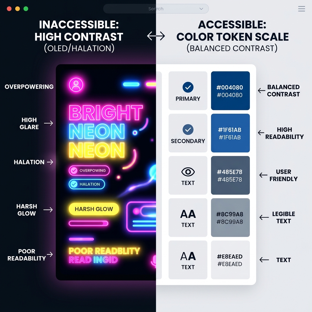
Verify that all text and background color combinations satisfy the [W3C Accessibility Guidelines](https://www.w3.org/WAI/). For body text, aim for a contrast ratio of at least 4.5:1. For dark-mode layouts, use off-white or light gray text rather than pure white, which reduces glare and prevents the text from blooming.
### Dark Mode Weight Adjustments
On dark backgrounds, light text appears optically thicker than dark text on light backgrounds. This is caused by light bleeding from the screen pixels into the surrounding dark pixels.
To maintain visual consistency between light and dark modes, reduce the font weight of your text slightly in dark mode. For example, if your light-mode body copy uses a weight of 400, adjust your dark-mode styling to use a weight of 370:
```css body { font-weight: 400; } @media (prefers-color-scheme: dark) { body { font-weight: 370; } } ```
This subtle optical correction ensures that your typography maintains the exact same visual weight across both display modes.
---
## Scenario Analysis: Typography Pairing in Action
Let's review five scenarios of typographic pairing across different industries, demonstrating how these rules apply in real-world technical and design environments.
### Scenario 1: The High-End Architectural Portfolio
* **Vibe:** Sophisticated, spacious, literary. * **Header Font:** Instrument Serif (Weight: 300, italic, low x-height). * **Body Font:** Satoshi Sans (Weight: 400, high legibility). * **Accent Font:** Geist Mono (Weight: 300, uppercase, for captions). * **Design Rationale:** This combination uses a high-contrast serif for elegant, cinematic headers, balanced by a clean, geometric sans-serif for project descriptions. The monospace accents add technical precision to floor plans. For an analysis of how these architectural geometries translate into property yields and energy-independent home models, check out the [BubbleWatch housing analysis](https://bubblewatch.ca/articles/rent-vs-buy-condo-vs-house-2026).
### Scenario 2: The Enterprise Financial Platform
* **Vibe:** Authoritative, secure, precise. * **Header Font:** Inter (Weight: 700, geometric, tight tracking). * **Body Font:** Inter (Weight: 400, regular, open spacing). * **Accent Font:** Roboto Mono (Weight: 500, for numbers). * **Design Rationale:** A single-font family system (Inter) provides absolute consistency and loading efficiency. Using a bold, tightly tracked weight for headers and a regular weight for body copy creates clean hierarchy. The Roboto Mono accents ensure all financial data and calculator inputs align perfectly in vertical columns, facilitating comparison. To see this financial mathematical precision in action, check out our [retirement calculator tools](https://simretire.ca/tips/working-while-collecting-cpp-2026).
### Scenario 3: The Creative Dev Log
* **Vibe:** Brutalist, code-first, sovereign. * **Header Font:** Aeonik Mono (Weight: 600, sharp, high contrast). * **Body Font:** Geist Sans (Weight: 400, humanist details). * **Accent Font:** Geist Mono (Weight: 400, for code snippets). * **Design Rationale:** Using a monospace font for headers signals technical competence and fits a developer-centric audience. The clean sans-serif body copy keeps long articles readable, preventing the fatigue caused by reading walls of monospace text. For a deep dive into GPU cloud costs and observability platforms built with these interfaces, see [Reacit's technology directory](https://reacit.com/articles/ai-developer-tooling-2026).
### Scenario 4: The Dynamic Lifestyle Blog
* **Vibe:** Friendly, approachable, energetic. * **Header Font:** Bricolage Grotesque (Weight: 800, ink traps, custom ligatures). * **Body Font:** Plus Jakarta Sans (Weight: 400, warm curves). * **Accent Font:** Instrument Serif (Weight: 400, italic, for quotes). * **Design Rationale:** Bricolage Grotesque uses custom ink traps to create a highly expressive, human header aesthetic. Plus Jakarta Sans offers open counters and warm curves that keep the body copy feeling friendly and easy to read.
### Scenario 5: The Industrial Energy Dashboard
* **Vibe:** Durable, industrial, high-frequency. * **Header Font:** Aeonik Sans (Weight: 800, condensed, geometric). * **Body Font:** Public Sans (Weight: 400, open counters, highly legible). * **Accent Font:** Space Mono (Weight: 500, for real-time telemetry). * **Design Rationale:** Built to withstand high-stakes environments where split-second readability is required. The condensed, heavy headers save space, while the government-backed Public Sans ensures maximum body copy clarity. Monospace accents are reserved for active telemetry streams. For real-time energy datasets and reserves ratios displaying this visual hierarchy, see [PetroEyes energy intelligence](https://petroeyes.com/news/reserves-to-production-ratio-country-2026/).
---
## Legal Auditing and Font Optimization Protocols
To complete your typography setup, you must implement strict performance and legal audits before deploying your assets to production.
### Typography Licensing Audits
Verify that all font files loaded on your server have active, valid licenses for web usage. Remember: * **Google Fonts:** Free for commercial use, but always download and self-host the files to protect user privacy and avoid external dependencies. * **Adobe Fonts:** Excellent for design mockups, but cannot be self-hosted directly without a Typekit enterprise plan. Use open-source equivalents in production if budget is a constraint. * **Commercial Type Foundries:** Require webfont licenses based on page views. Audit your traffic logs annually to ensure you are not violating the license tiers.
### Font File Compression and Sub-Setting
To maximize site performance and secure a high Largest Contentful Paint (LCP) score, compress and optimize your font files: * **Format:** Convert all font files to WOFF2, which offers 30% better compression than legacy WOFF formats. * **Sub-setting:** Remove unused character glyphs from your font files. If your site only publishes in English, remove Cyrillic, Greek, and special math glyphs from the file, reducing the file size from 150KB to under 20KB. * **Self-Hosting:** Serve font files directly from your own domain and configure aggressive caching headers (`Cache-Control: public, max-age=31536000, immutable`), ensuring that return visitors load the fonts instantly from their browser cache.
**What to Read Next:** Once your typographic system is locked down, you must integrate it into a cohesive visual system. Read our [2026 Brand Identity Selection Guide](/asset/brand-identity-selection-guide-2026/) to master color psychology, logo vector properties, and platform-agnostic design tokens.
Directory Analysis & Suitability
Key Advantages
- Variable font axis tips
- Optical dark mode weight adjustments
- Mathematical line-height guides
Considerations
- Requires variable-capable fonts
Platform Compatibility
Web Environment
Exceptional
Mobile & Touch
Exceptional
Desktop Software
Exceptional