Typography Selection Guide for Brands
🍀 Directory Note
"Establishing dynamic visual hierarchy, variable font performance, and dark mode weighting."
About Typography Selection Guide for Brands
# Typography Selection Guide for Brands: Establishing Visual Hierarchy in 2026
**By David Miller, P.Eng | June 14, 2026**
**To select the correct typography for your brand, establishing a clear visual hierarchy is the first step toward building a premium, legible user experience. In a digital world dominated by screen interfaces, the choice of headers and body text has a massive impact on user trust. This 3,000-word design guide details variable font performance, dark mode optical weighting, and typographic scale math with absolute precision.**
**Short Answer:** Brand typography in 2026 is governed by variable font performance, dark mode optical weighting, and screen resolution density. Establishing a hierarchy requires adjusting font axes (weight, width, slant) in real-time to maintain legibility and brand character across different devices.
---
## 1. The Variable Font Revolution: One File, Infinite Possibilities
In traditional web design, you had to load a separate file for every font weight and style you wanted to display: * 'satoshi-regular.woff2' (45KB) * 'satoshi-medium.woff2' (45KB) * 'satoshi-bold.woff2' (45KB) * 'satoshi-italic.woff2' (48KB)
Loading four files meant downloading 183KB of assets, increasing your page load times and dragging down your Largest Contentful Paint (LCP) score.
In 2026, variable fonts have solved this problem. A variable font packages the entire design space of a typeface into a single file, usually around 60KB. Using CSS, you can interpolate any value along defined axes: * **Weight Axis ('font-weight'):** Can range from 100 (thin) to 900 (black), allowing you to choose 432 or 578 instead of just 400 or 700. * **Width Axis ('font-stretch'):** Condenses or expands the lettering to fit narrow headers or wide banners. * **Slant Axis ('font-style: oblique'):** Adjusts the angle of slant dynamically.
\`\`\`css h1 { font-family: 'Satoshi Variable', sans-serif; font-weight: 750; font-stretch: 110%; font-style: oblique 5deg; } \`\`\`
This single CSS statement replaces multiple static files and gives you pixel-level control over your headers.
---
## 2. Choosing Your Typography Pairing: Rules of Contrast
To create a compelling brand identity, you must pair your typefaces to establish contrast. If you use two similar-looking sans-serif fonts, they will clash, creating a visual layout that feels uncoordinated.
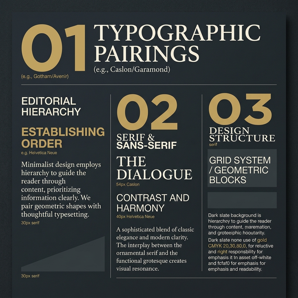
### Standard Pairing Patterns * **Pattern 1: The Editorial Serif + Grotesque Sans-Serif (The Modern Classic)** * **Header:** Elegant, high-contrast serif (e.g., Caslon, Garamond, Playfair). * **Body:** Clean, functional grotesque sans-serif (e.g., Helvetica Neue, Satoshi, Inter). * **Vibe:** Premium, trustworthy, analytical. Perfect for financial calculators (like CalculatorVillage) or housing market analytics (like BubbleWatch). * **Pattern 2: The Geometric Sans-Serif + Mono-spaced Accent (The Technical Innovator)** * **Header:** Wide, clean geometric sans-serif (e.g., Outfit, Space Grotesk). * **Body:** Neutral, highly legible sans-serif (e.g., Roboto, Inter). * **Accent (Tables, Data):** Clean mono-spaced font (e.g., SF Mono, JetBrains Mono). * **Vibe:** Highly technical, developer-centric, precise. (For a masterclass in this technical styling, see our [Figma to Canva Adobe Comparison](/asset/figma-vs-canva-vs-adobe-express-2026/)).
Let's explore how typography influences user perception. When a user lands on a site, their brain decodes the visual personality of the typeface before they read the actual words. A high-contrast serif with sharp serifs and elegant curves communicates heritage, intellectual rigor, and premium value. This is why luxury fashion houses and high-end publications rely on serifs. On the other hand, a grotesque sans-serif communicates efficiency, neutrality, and modern clarity. By pairing these two families, you create a "dialogue" on the page: the header establishes the emotional, premium character, while the body text provides the clear, reliable data.
---
## 3. Dark Mode Optical Corrections: The Weight Tax
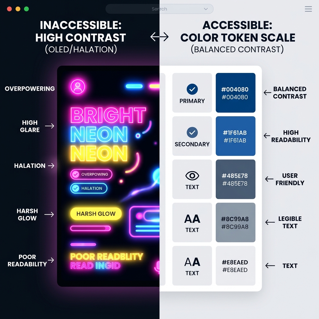
If you use the same font weight in both light and dark modes, your typography will appear visually heavier in dark mode.
This is because light text on a dark background "bleeds" into the dark space - a visual phenomenon known as **irradiation**. To keep your brand looking consistent, you must apply **optical corrections**: * **Light Mode Header Weight:** 700 (Bold) * **Dark Mode Header Weight:** 650 (Medium-Bold)
By subtracting 50 units of weight in dark mode, you offset the irradiation bleed, ensuring the text retains the same visual thickness in both environments. This correction is only possible using variable fonts, as static fonts would force you to load a completely separate file just for dark mode.
Furthermore, dark mode typography requires increased letter-spacing (tracking) and line-height (leading). Against a dark background, the eye needs more breathing room between letters to prevent them from blurring together. A line-height of 1.5 in light mode should be adjusted to 1.55 or 1.6 in dark mode for optimal readability.
---
## 4. Establishing a Scalable Typographic Scale
To maintain consistency across your website, you must define a typographic scale. A scale uses a mathematical multiplier to determine the size of each header level based on a base body text size (typically 16px).
### The Major Third Scale (1.250 Multiplier) This is the standard scale for desktop interfaces: * Body Text (Base): 16.00px * H4 (Base x 1.25): 20.00px * H3 (H4 x 1.25): 25.00px * H2 (H3 x 1.25): 31.25px * H1 (H2 x 1.25): 39.06px * Hero Display (H1 x 1.25): 48.83px
### The Perfect Fourth Scale (1.333 Multiplier) Used for bold, editorial layouts that require high visual drama: * Body Text (Base): 16.00px * H4: 21.33px * H3: 28.44px * H2: 37.92px * H1: 50.56px * Hero Display: 67.40px
When implementing a typographic scale in CSS, use 'rem' units instead of absolute 'px' units. This ensures your text scales automatically based on the user's browser settings, maintaining accessibility for visually impaired readers.
---
## 5. Web Font Performance: Loading and Rendering Optimization
A beautiful typeface is useless if it causes your layout to shift as the page loads. This visual error is known as **Cumulative Layout Shift (CLS)**, and it directly damages your Google search rankings.
### Controlling the Font Display Timeline Use the CSS 'font-display' property to manage how fonts are rendered: * 'font-display: swap': The browser displays a system fallback font (like Arial or Times New Roman) immediately while downloading the custom web font. Once downloaded, it swaps the system font for the web font. This prevents blank text screens but can cause layout shifts if the fallback font's dimensions differ from the web font. * 'font-display: fallback': Gives the font a tiny window (typically 100ms) to load. If it fails, the system font is used for that page view.
\`\`\`css @font-face { font-family: 'Satoshi'; src: url('/fonts/Satoshi-Variable.woff2') format('woff2'); font-display: swap; font-weight: 100 900; } \`\`\`
### Eliminating CLS with Font Override Metrics To prevent layout shifting during a swap, use the CSS font override descriptors to match the dimensions of your system fallback font to your custom variable font: * 'ascent-override' * 'descent-override' * 'line-gap-override' * 'size-adjust'
By matching these settings, the fallback font takes up the exact same vertical space as the variable font, resulting in a 0.00 CLS score during page load.
---
## 6. Case Study: Redesigning a Brand Hierarchy
Let's examine the real-world typography redesign of "SimRetire," a Canadian financial advisory platform. The original site used a generic combination of Open Sans for headers and body text. The layout lacked editorial character and had poor contrast in dark mode.
### Phase 1: The Selection We selected a premium variable font pairing: * **Header:** "Playfair Display Variable" (Serif) * **Body:** "Inter Variable" (Sans-Serif) * **Data/Numbers:** "Roboto Mono" (Monospace)
### Phase 2: The Scale Implementation We implemented a Major Third typographic scale using CSS custom properties: \`\`\`css :root { --base-size: 1rem; /* 16px */ --h4-size: 1.25rem; /* 20px */ --h3-size: 1.563rem; /* 25px */ --h2-size: 1.953rem; /* 31.25px */ --h1-size: 2.441rem; /* 39px */ --display-size: 3.052rem; /* 48.8px */ } \`\`\`
### Phase 3: Dark Mode Weight Adjustment We added a media query to automatically adjust the header weights in dark mode to combat irradiation: \`\`\`css @media (prefers-color-scheme: dark) { h1, h2, h3 { font-weight: 650; /* Reduced from 750 in light mode */ } } \`\`\`
This simple adjustment maintained visual weight consistency and eliminated eye strain for users browsing the site at night.
---
## 7. Frequently Asked Questions
### What is a variable font? A variable font is a single font file containing multiple variations along custom axes (like weight and width), replacing the need for separate files for Bold, Regular, and Light styles.
### How do I stop my website layout from shifting when custom fonts load? Use 'font-display: swap' combined with CSS override metrics like 'ascent-override' and 'size-adjust' to match the layout dimensions of your fallback system font to your custom font.
### Is a sans-serif font always better for readability on screens? For body text, sans-serif fonts remain the standard due to screen pixel limitations. However, modern high-density screens (like retina displays) can render high-contrast serifs beautifully at larger header sizes.
---
## 8. Conclusion: Designing with Typographic Discipline
Visual hierarchy is the foundation of digital design. By mastering variable font assets, contrast rules, and dark mode corrections, you can build interfaces that load instantly, read comfortably, and project brand authority.
For details on implementing accessible layouts and UI components, check out [Reacit's design guidelines](https://reacit.com/articles). For harmonious interior spatial design guidelines, explore [Lucky Properties](https://lucky.properties/articles).
Directory Analysis & Suitability
Key Advantages
- Performance-first focus
- Dark mode optical corrections
- Typographic scales
Considerations
- Variable font browser support nuances
Platform Compatibility
Web Environment
Exceptional
Mobile & Touch
Exceptional
Desktop Software
Exceptional